
One awkward internal link can make a solid affiliate post feel like a sales script. In 2026, affiliate anchor text still helps search engines understand page relationships, but its first job is simpler, it should guide the reader.
That matters more on affiliate sites, where reviews, comparisons, and roundups often point to the same few money pages. If every link repeats the same phrase, your site starts to look forced. Clean anchors keep intent clear, reduce repetition, and make the click feel earned.
What affiliate anchor text should do in 2026
The safest rule is also the simplest one. Your anchor text should describe the page the reader is about to visit, in plain language.
Current summaries of Google link guidance keep coming back to the same idea: use descriptive text, avoid vague filler, and don’t treat anchor text like a place to cram keywords. “Read more” tells readers almost nothing. “Email tool comparison for beginners” sets the expectation fast.
At the same time, internal links still shape how pages connect across your site. A solid internal linking guide makes the bigger point well, internal links help with discovery, relevance, and site structure. So the anchor matters, but the pattern matters too.
For affiliate sites, that means your anchors should match page intent:
- A review link should sound like a review
- A comparison link should sound like a comparison
- A pricing or signup link should sound commercial
- A guide link should sound informational
Good affiliate anchor text names the next step. It doesn’t try to jam the whole keyword into every link.
Exact-match phrases aren’t banned. They’re just easy to overuse. If ten articles all point to one review with the same commercial phrase, the issue isn’t one link. It’s the footprint you’ve created.
The anchor text patterns that create risk on affiliate sites
The biggest risk in 2026 isn’t one “bad” anchor. It’s repetition that feels engineered.
A common mistake is forcing the same keyword into links from blog posts, sidebars, author boxes, and related-post widgets. That kind of sitewide pattern can make your internal linking look mechanical. It also wears down trust because readers keep seeing the same pitch.
Another problem is intent mismatch. If the anchor says “best CRM tools for agencies” but the click lands on a single-product review, the link breaks the promise. That’s bad UX, and it muddies page intent.
Watch for these red flags:
- Keyword repetition: the same money phrase repeated across dozens of posts
- Forced matching: anchors written for rankings, not for sentence flow
- Wrong destination: comparison-style anchors pointing to single reviews
- Sitewide money links: footer or sidebar anchors pushing the same affiliate page everywhere
This also overlaps with internal competition. If multiple posts target near-identical buyer terms, your anchors can blur the difference between them. A quick affiliate content cannibalization audit often shows why rankings bounce between “review,” “alternatives,” and “best” pages.
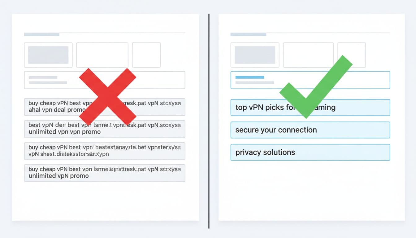
Good vs bad affiliate anchor text for common page types
Examples make this easier. The goal isn’t to sound clever. It’s to sound accurate.
Here’s a quick side-by-side view:
| Page type | Risky anchor text | Better anchor text | | | — | — | | Single review | best cheap hosting | full hosting review | | Comparison post | best email tool | email tool A vs B | | Roundup page | buy VPN now | top VPN picks for streaming | | Alternatives page | cheap course platform | course platform alternatives for beginners |
The better versions work because they match the job of the destination page. They also give readers a reason to click without overselling.

A few practical examples help:
For a review page, “our full review” is often better than “best tool.” The reader expects an opinion, pros and cons, and maybe pricing.
For a comparison post, use anchors like “Tool X vs Tool Y” or “compare these two options.” That tells the reader a choice is coming.
For commercial-intent content, shorter anchors can work well when the context is clear. “See pricing,” “compare plans,” and “what’s included” feel natural after you’ve already named the product. That’s where smart placement matters, and this affiliate link placement map is a useful model for matching link text to the reader’s moment.
For roundups and best lists, avoid making every internal link sound like a checkout button. Mix anchors like “beginner-friendly picks,” “budget options,” and “best for small teams.” Those variations keep the page readable while still signaling relevance.
A simple rule set for updating your anchors
If you’re cleaning up older content, keep the process boring and repeatable.
- Match the destination: Review to review, comparison to comparison, guide to guide.
- Vary repeated links: Don’t send every post to the same page with the same phrase.
- Keep commercial language in commercial spots: “See pricing” fits better near offer details than inside a general intro.
- Skip sitewide sales anchors: Sidebars and footers shouldn’t hammer one money term across the whole site.
- Read anchors out loud: If the sentence sounds stiff, rewrite it.
When retrofitting existing posts, use the same care you’d use for any monetization edit. This guide on how to add affiliate links without losing rankings pairs well with an anchor cleanup, because both tasks live or die on intent and restraint.
Keep your internal anchors sounding human
If every internal link says the same money phrase, readers notice. Search systems do too. The safest move is still the most useful one, write anchors that describe the next page honestly and fit the sentence around them.
Pick your top affiliate pages this week and audit the links pointing at them. If the pattern feels repetitive, fix the pattern first.