
A good affiliate comparison table feels like a helpful shelf label in a store. It doesn’t “sell,” it points. Readers arrive with a goal, and your table either makes the next step obvious, or it turns into a scroll-and-bounce trap.
The fix isn’t adding more buttons. It’s clarity, structure, and one clean path to action for each product.
Start with how people actually use comparison tables
Most readers don’t study tables. They scan them like a menu. They want to answer three questions fast: “Which one’s best for me?”, “What’s the catch?”, and “Where do I click?”
So, before you touch design, set the decision shape:
- Keep choices tight. Three products usually convert better than eight. Too many options feels like homework.
- Name the “why” in plain words. “Best for beginners” beats “Editor’s pick.”
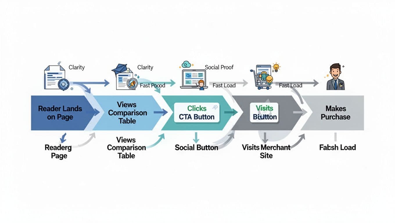
- Put the click where the decision happens. If the table is the decision point, the CTA belongs inside the table, not two paragraphs later.
A simple way to plan placement across the whole post is this internal guide on the affiliate link placement map. It’s helpful because it treats the table as a high-intent zone, not just decoration.
One more thing: a comparison table works best when you’ve already earned trust. If your post hasn’t explained the use case yet, the table looks like an ad with columns.
A table gets clicks when it reduces doubt, not when it adds hype.
To sanity-check your structure, skim a UX-focused breakdown like LogRocket’s guide on designing feature comparison tables. You’ll notice the same pattern: less clutter, clearer labels, and strong alignment between rows and real decisions.
A ready-to-copy HTML/CSS affiliate comparison table (with sample products)
Start by placing a short disclosure line right above the table, before any affiliate links. Keep it human: “Disclosure: Some links are affiliate links. If you buy, I may earn a commission at no extra cost to you.”
If you want copy-and-paste wording options that still feel natural, use these affiliate disclosure examples.
Below is a simple template you can drop into a page (swap in your URLs). It highlights one pick, keeps CTAs consistent, and includes accessibility basics (headers, scopes, caption).
HTML:
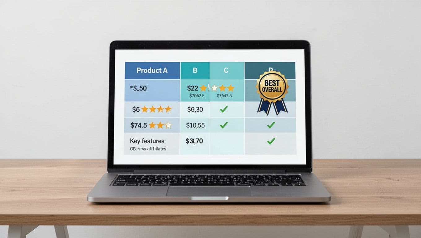
| Feature | Product A (Best Overall) | Product B | Product C |
|---|---|---|---|
| Best for | Most people | Budget buyers | Advanced users |
| Price | $29/mo | $19/mo | $49/mo |
| Free trial | Yes | No | Yes |
| Standout feature | Easy setup | Lowest cost | Deep reporting |
| Rating | 4.7/5 | 4.3/5 | 4.6/5 |
| Action | Check price | Check price | Check price |
CSS: .aff-compare { width:100%; border-collapse:collapse; font-size:16px; } .aff-compare caption { text-align:left; padding:10px 0; font-weight:600; } .aff-compare th, .aff-compare td { border:1px solid #d7dde3; padding:12px; vertical-align:middle; } .aff-compare thead th { background:#f4f7fb; } .aff-compare tbody tr:nth-child(even) { background:#fafcff; } .aff-compare .best { background:#e8f6ff; } .aff-compare .btn { display:inline-block; padding:10px 12px; border-radius:8px; background:#0b6ea8; color:#fff; text-decoration:none; font-weight:600; } .aff-compare .btn:focus { outline:3px solid #111; outline-offset:2px; }
Accessibility notes that matter in real life:
- Use
th scope="col"andth scope="row"so screen readers understand structure. - Keep contrast high (don’t use light gray text on white).
- If you add tooltips, make the trigger focusable, and don’t hide key info behind hover-only behavior.
Mobile-responsive variant: stacked cards that are easy to tap
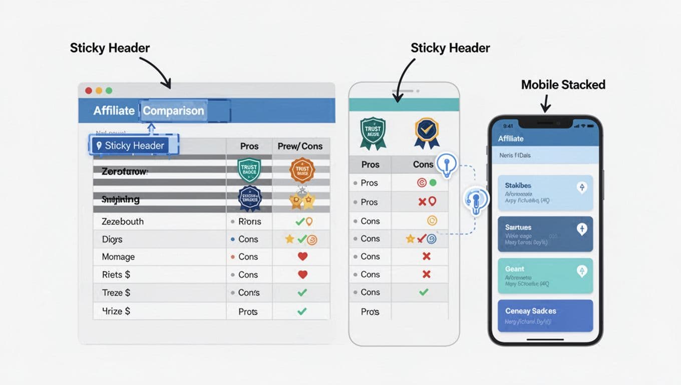
Tables often break on phones because columns get squeezed into unreadable postage stamps. The easiest fix is a stacked layout: each product becomes a “card,” and each row becomes a label/value pair.
You can keep the same HTML and add this CSS to switch layouts on small screens:
CSS (add-on): @media (max-width: 720px) { .aff-compare, .aff-compare thead, .aff-compare tbody, .aff-compare th, .aff-compare td, .aff-compare tr { display:block; } .aff-compare thead { position:absolute; left:-9999px; top:-9999px; } .aff-compare tr { border:1px solid #d7dde3; margin:0 0 12px; border-radius:10px; overflow:hidden; } .aff-compare th[scope=”row”] { background:#f4f7fb; font-weight:700; } .aff-compare td, .aff-compare th[scope=”row”] { border:none; border-bottom:1px solid #eef2f6; } .aff-compare td { padding:12px; } .aff-compare .btn { width:100%; text-align:center; } }
Two practical mobile tips:
- Put the CTA row near the bottom of each card, then make the button full width.
- Keep labels short (“Free trial,” “Price,” “Best for”), so the card doesn’t feel long.
If you’re using WordPress, table plugins can handle this, but still check the mobile output manually. This NinjaTables guide on tables for affiliate marketing is a decent reference for common table types and what tends to perform.
Testing and optimization: improve clicks without guesswork
Once your table is clean, start testing like a mechanic, one adjustment at a time.
Easy A/B ideas that don’t require rewriting the post:
- Swap CTA copy: “Check price” vs “See plans” vs “Try free.”
- Move the table: after the first recommendation paragraph vs after the full guide.
- Change the highlight: “Best Overall” vs “Best for Beginners” (match intent).
- Reduce rows: keep only the 5 to 7 rows that decide the purchase.
Track clicks in a way you can trust. UTMs help, but event tracking tells you which table and which button drove the click. This internal walkthrough on GA4 affiliate tracking shows a clean naming system for UTMs and click events, which makes your reports usable months later.
Heatmaps can add context when numbers look weird. For example, you might find readers tap the product name, not the button. In that case, link the product name too, then keep the button as the main action.
Also watch load time. Comparison tables can get heavy when you add icons, scripts, and fancy sorting. Fast pages win because the reader stays in “decision mode,” not “waiting mode.”
Final checklist before you publish
- Disclosure is visible above the table, and before any affiliate link.
- The table has 3 to 4 products max (unless your niche truly needs more).
- One column is clearly positioned as the best fit for a defined reader type.
- CTAs are consistent, one primary button per product.
rel="sponsored nofollow"is used on affiliate links (and program rules are followed).- Table headers use
thwith correctscopevalues. - Mobile layout is readable, buttons are easy to tap, nothing overflows.
- Click tracking is in place (UTMs and/or an outbound click event).
- You tested at least one change after 7 to 14 days of data.
A strong affiliate comparison table doesn’t beg for clicks. It removes friction, shows the tradeoffs, and makes the next step simple. Build one clean version, track it, then improve one detail at a time.