
Most affiliate buttons don’t fail because of color. They fail because the words are too vague.
Strong affiliate CTA copy makes the next step obvious, safe, and worth the tap. That matters even more in 2026, because readers skim faster, browse on mobile, and ignore anything that feels pushy. If your button says “Learn More,” you’re asking them to guess.
The fix is simple. Match the button to user intent, lower friction, and test cleaner copy. Here’s how to do it.
Why generic CTA buttons lose clicks now
A button is like a road sign. If it points nowhere clear, people keep driving.
That’s why “Click Here,” “Submit,” and “Get Started” often underperform in affiliate content. They don’t tell the reader what happens next. On a review, “Buy Now” can also feel too aggressive, especially if the reader is still comparing options.
Better affiliate CTA copy mirrors the section above it. If you just explained features, try “See What’s Included.” If you covered price, use “Check Current Pricing.” If you shared setup steps, go with “View the Setup Guide.”
Trust matters just as much as clarity. A button placed too early can feel like a trap. That’s why smart placement still matters. This affiliate link placement map is a helpful reminder that buttons work best near decision points, not at random. In the same way, small bits of proof near a CTA can calm doubt, and these ideas for build trust with proof elements make that easier.
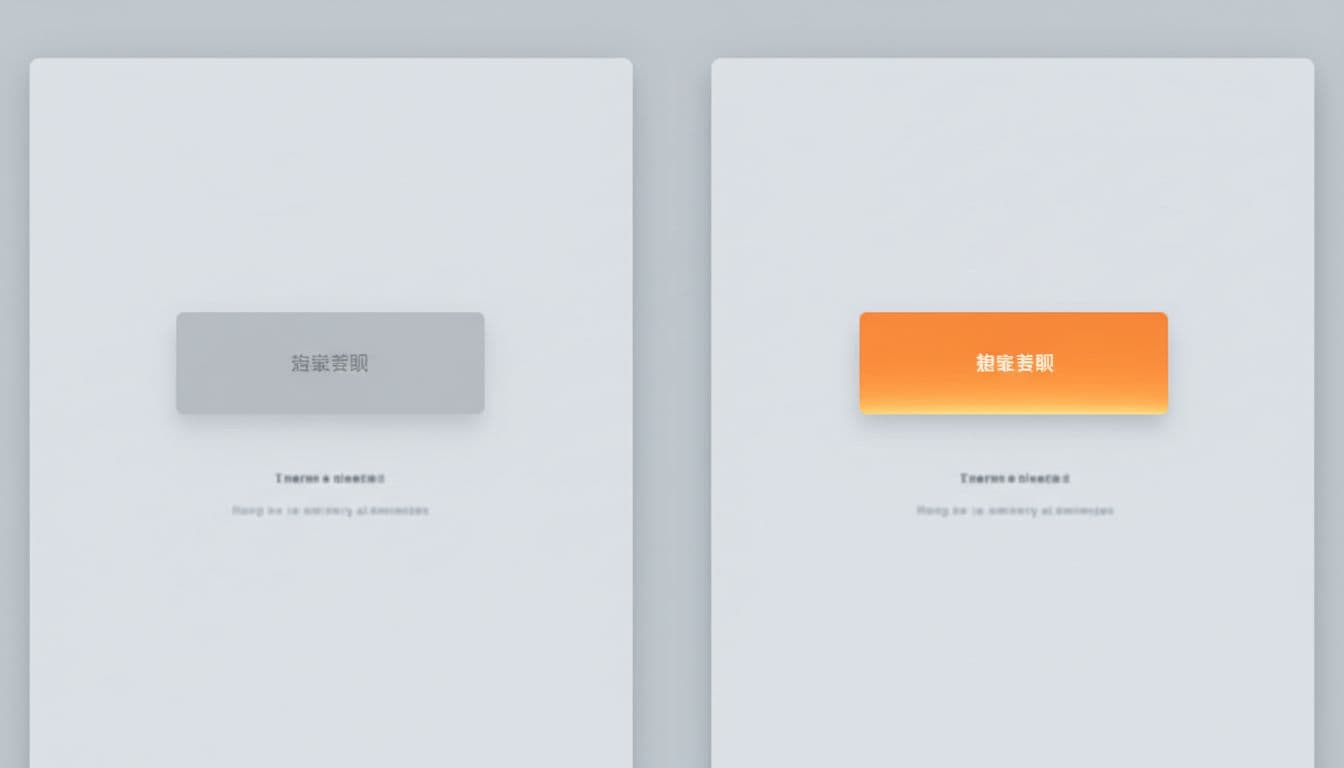
Design helps attention, but copy earns the click.
Good design still supports performance. Use strong contrast, enough white space, and a thumb-friendly size. Still, the words do the heavy lifting. Recent roundups on CTA best practices keep coming back to the same point: clarity beats cleverness.
If the same button could sit on ten different pages, it’s probably too vague.
Affiliate CTA copy formulas that match buyer intent
You don’t need magic words. You need patterns that fit what the reader wants right now.
This quick table shows the difference:
| Reader intent | Weak copy | Better copy | Why it works |
|---|---|---|---|
| Early research | Learn More | See How It Works | Matches curiosity |
| Comparing tools | View Product | Compare Features & Pricing | Fits review-mode thinking |
| Price-checking | Buy Now | Check Current Price | Lowers commitment |
| Risk-sensitive | Start Now | Try It Risk-Free | Reduces fear |
| Bonus-driven | Get Access | Claim My Bonus | Makes value clear |
The takeaway is simple: use a verb plus a clear outcome. That’s the base formula behind most high-click buttons.
A few versions work well across affiliate pages. “Check Current Price” works on comparison tables. “See What the Free Plan Includes” fits software reviews. “Start the 14-Day Trial” is better than “Get Started” because it names the offer. “Compare Plans Side by Side” fits readers who aren’t ready to buy yet.
In 2026, short and honest copy keeps winning. Creator-style phrases like “My Top Pick” or “Claim My Bonus” can perform well when the page feels personal and the promise is real. The newest 2026 CTA button examples and these broader call to action examples that convert both show the same trend: concise, specific buttons beat generic ones.
Personalization can help too, but only when it’s true. If the landing page changes by device, location, or plan type, matching the button text can lift clicks. If it doesn’t, fake personalization just feels sloppy.
Before-and-after rewrites you can use today
Tiny wording changes often bring the biggest gains. Here are practical rewrites for affiliate pages.
- Too vague: “Click Here”
Better: “See What the Free Plan Includes” - Too broad: “Learn More”
Better: “Compare Features & Pricing” - Too aggressive: “Buy Now”
Better: “Check Today’s Lowest Price” - Too empty: “Get Started”
Better: “Start the 14-Day Trial” - Too generic: “Read Review”
Better: “See My Full Test Notes”
These rewrites work because they answer a hidden question. What will I see? What will I get? What risk am I taking?
Also, match button tone to page stage. A tutorial should usually use softer copy than a product roundup. For older posts, it’s smart to add affiliate links to old posts safely and update the CTA language at the same time, so the new button fits the page instead of feeling pasted in.
How to test CTA copy without fooling yourself
Testing works best when it stays boring.
Change one thing at a time. If you change copy, color, size, and placement together, you won’t know what caused the lift. Start with one high-intent section and one main button.
Use this simple framework:
- Pick one page and one CTA.
- Test one copy angle, such as “Check Current Price” vs. “See Pricing & Plans.”
- Split results by device and page type.
- Judge winners by outbound CTR, EPC, and approved sales, not clicks alone.
That last point matters. Some buttons attract more clicks but worse traffic. If sales don’t rise with CTR, the copy may be over-promising.
Let each test run through a normal traffic cycle. Then keep the winner, log the result, and move to the next page. Broader call-to-action guidance for 2026 also stresses intent-match over flashy wording, and that lines up with what affiliate data keeps showing.
Conclusion
The best affiliate CTA copy doesn’t sound louder. It sounds clearer.
Replace one vague button this week with a promise the reader can understand in two seconds. Then add proof, place it near the right moment, and test it cleanly. In 2026, more clicks usually come from less guesswork.