
Most review post clicks die in the last few inches before the reader acts. That’s where affiliate FAQ blocks help. They answer the doubt that slows a buyer down, then point to the next step without turning your review into a pitch.
For intermediate affiliates, that matters more than adding extra buttons. A tight FAQ block can lift product-page clicks because it matches intent, builds trust, and stays easy to scan on mobile.
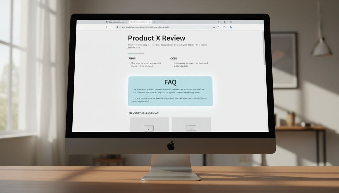
Why affiliate FAQ blocks work when reviews stall
A solid review already covers features, pricing, and pros and cons. Still, readers often stop because one objection remains. They may wonder if the tool is too hard, too expensive, or a bad fit.
That last bit of friction is where FAQ blocks earn their place. Think of them like the clerk near the checkout lane, not the loud sign at the door. They answer the final question that keeps a buyer from moving.
Good FAQ blocks also match user intent. Early questions build clarity, such as “Who is this for?” Mid-funnel questions reduce uncertainty, such as “How does it compare?” Late questions remove risk, such as “Is there a refund policy?”
By 2026, most affiliate sites shouldn’t count on FAQ rich results as the payoff. Those search features are limited and inconsistent for normal review publishers. Build FAQ blocks for readers first, then for clean answer chunks that search engines and AI tools can scan.
The best FAQ answer removes one doubt and opens one clear next step.
Trust matters here, too. If you answer pricing, refunds, or support questions, use current facts. Before you make those claims, run the offer through an affiliate program checklist.
Best placement spots for affiliate FAQ blocks
Placement changes everything. Drop a FAQ block too early, and it feels like a sales move. Put it after proof, and it feels helpful.
This quick map keeps the block aligned with buyer intent:
| Place in the review | Best question type | Better CTA angle |
|---|---|---|
| After pros and cons | Fit, ease, deal-breakers | See current pricing |
| After a comparison table | Alternatives, plan differences | Compare plan options |
| Near the conclusion | Refunds, trial, final reassurance | Visit the official site |
The sweet spot for most review posts is after pros and cons or right below a comparison table. At that point, the reader has context. They’re no longer asking “What is this?” They’re asking “Should I click through?”
A short FAQ block near the end works well for late deciders. It catches readers who needed the full story before taking action. On the other hand, a giant FAQ section above the fold usually hurts more than it helps, unless the page targets branded search and the visitor already knows the product.
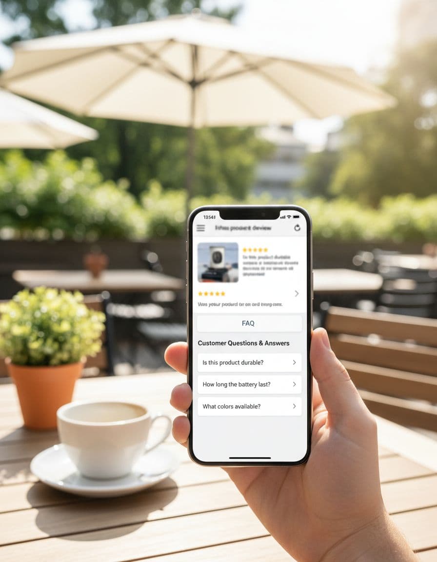
Keep the block tight. Three to five questions is enough for most reviews. If you need wider placement ideas across intros, tables, and close-of-post CTAs, this guide on where to position links for clicks fits well with FAQ planning.
Proven FAQ questions that spark clicks without sounding pushy
The strongest questions are purchase-adjacent. They don’t repeat your whole review. Instead, they answer the exact concern a buyer has right before leaving the page.

Use questions like these in review posts and comparison articles:
- “Is this worth it for beginners?” This works well after a setup section. End with a fit statement, then a soft CTA like “see starter plan details.”
- “How does it compare to [alternative]?” Put this below a comparison table. Name one meaningful difference before linking.
- “Does it have a free trial or refund policy?” Risk-reduction questions often win clicks better than hype.
- “What setup work is required?” This is strong for software, courses, and tools with onboarding.
- “Who should skip this product?” Few trust-builders work faster than honest disqualification.
Your answers should stay short. Two or three sentences usually beat a long paragraph. Each answer needs one job: handle the objection, then guide the next step.
Bad FAQ copy sounds like this: “Yes, it’s the best tool, click now before the deal ends.”
Better copy sounds like this: “If you want simple setup and don’t need advanced features, this is a good fit. You can check the current plan options on the official page.”
Notice the difference. The second version sounds calm, not needy.
Link copy matters, too. In FAQ answers, “see pricing,” “check integrations,” and “view setup steps” often beat “buy now.” Match the link to the promise in the sentence. If the answer talks about trial terms, link to the trial page or product page section that covers them.
Make FAQ blocks easy to trust on mobile
A big share of review traffic now comes from phones, so mobile readability isn’t optional. Long answers, tiny tap targets, and stacked buttons kill momentum fast.
Use accordion-style questions if they load fast and don’t hide key details. Keep answers brief, leave white space, and use one clear link per answer. Two links can work in some cases, but only when each serves a different intent, such as pricing versus setup.
Trust shows up in small details. Add a plain disclosure before the first affiliate link. Mention real downsides. Update time-sensitive answers when pricing or trial terms change. If you’re adding FAQ blocks to older money pages, follow a safe SEO affiliate updates workflow so the page keeps the same intent.
Think back to that last-inch hesitation before a reader clicks. A good FAQ block clears it with the right question, the right placement, and a low-pressure next step.
Pick one review post this week. Add three buyer-intent questions, trim each answer, and test calmer CTA copy like see pricing or check setup details. More clicks usually come from less friction, not more hype.