
Price pages often miss because buyers can’t see their own numbers inside the offer.
A well-built affiliate savings calculator fixes that fast. It turns a flat pricing grid into a personal business case, which helps direct signups and affiliate-driven conversions.
If you want more trials, demos, or paid starts, the calculator block has to do more than look smart. It has to reduce doubt right when pricing friction shows up.
Why calculator blocks move buyers closer to the click
People don’t buy tiers first. They buy a better outcome at a believable cost.
That shift matters on affiliate pages because the visitor often arrives skeptical. They may trust the content, but they still need proof that switching tools will save money, time, or both. A calculator gives them that proof in seconds. It also works well with 2026 pricing trends, where SaaS brands mix seat-based tiers, usage pricing, and ROI claims. If you want to benchmark the math behind your offer, a pricing strategy calculator can help you test the logic before it goes live.
The psychology is simple. Your visitor sees their current cost first, then your projected cost, then the gap. That gap becomes the story. Instead of asking, “Is this plan expensive?” they start asking, “Why am I still overpaying?”
Put the calculator before the pricing table. Buyers need a number before they judge a plan.
For affiliate traffic, the block also improves intent quality. Someone who enters team size, current tool spend, and usage volume is far warmer than someone who scans a pricing card and leaves. That context becomes even more useful when your affiliate program pays on trials, upgrades, or revenue share. If your partner setup still relies on weak tracking rules, it’s worth learning how to spot last-click traps before you send more paid or partner traffic into the page.
The best blocks feel less like a widget and more like a guided answer. They don’t ask for ten fields. They ask for the three or four numbers that shape value.
What to include in an affiliate savings calculator
Start with inputs that a buyer already knows, or can estimate fast. If the form feels like tax prep, conversions drop.
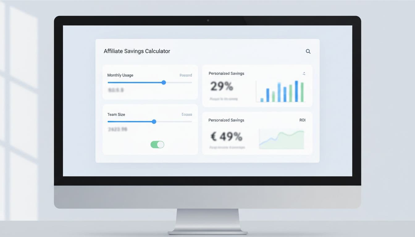
This simple structure works well for most SaaS pricing pages:
| Input | Why it matters | Example output |
|---|---|---|
| Team size | Maps the visitor to a plan | 18 users |
| Monthly usage | Fits usage-based pricing | 24,000 actions |
| Current software spend | Creates the savings anchor | $340 saved per month |
| Setup or migration cost | Frames payback | Break-even in 6 weeks |
The takeaway is straightforward. Ask for one current-cost number, one usage number, and one commitment number, then return a result that feels concrete.
For example, a help desk SaaS affiliate page could show this output: “Current spend: $960/mo. Projected spend: $620/mo. Estimated savings: $340/mo, or $4,080/year.” That’s clear enough to support a click, yet simple enough to trust.
Use formulas that buyers understand at a glance:
- Monthly savings: current monthly cost minus projected monthly cost
- Annual savings: monthly savings times 12
- Payback period: onboarding cost divided by monthly savings
- Recommended plan: first tier that fits team size plus usage limit
Keep the first view short. Then hide advanced inputs behind “More detail” for users who want precision. Also, prefill realistic defaults from ad copy, industry, or partner segment. A founder with 5 seats shouldn’t see enterprise assumptions.
If you offer annual billing or discounts, check the downside before you bake those numbers into the block. A discount impact calculator is useful for testing where a promo helps conversion but hurts margin too much.
Where the block should sit, and how to turn results into action
Placement changes performance more than most teams expect.
The strongest layout is usually headline, proof, calculator, recommended plan, then full pricing table. That order works because the visitor first sees the promise, then gets a personal number, then lands on the matching tier. If you want a sharper sense of where those decision links belong around the rest of the page, this affiliate link placement map pairs well with calculator testing.

A few layout rules keep the block from becoming clutter:
- Show the result beside the inputs: Don’t force a scroll to see the payoff.
- Highlight one recommended plan: Too many choices kill momentum.
- Keep a sticky result summary on mobile: People forget the number once they scroll.
- Place social proof near the output: Reviews work better after the math lands.
CTA copy should match the result, not the page template. Good examples include:
- Start free and save $340/mo
- Get the plan for 18 users
- See my full cost breakdown
- Book a 10-minute savings review
From an implementation side, treat the calculator like a tracked conversion asset, not a design extra. Pass the chosen plan, projected savings, and input values into hidden form fields. Fire events for field completion, result view, and CTA click. In 2026, many teams run this through a block-based CMS or front-end component, then send the data into server-side analytics for cleaner attribution.
For affiliate programs, tie the CTA to the attribution method. If a program rewards free trials, push the visitor to a trial CTA. If commissions depend on paid starts or upgrades, send them to a pricing-aware step with the selected plan preloaded. You can also model partner economics with an affiliate commission calculator before picking which offer deserves the page.
The best pricing pages don’t ask buyers to do math in their heads. They give them a believable number, link it to the right plan, and make the next step feel obvious.
Start with one audience segment and three inputs. Test the result message, the recommended tier, and the CTA copy before you redesign the whole page. Clarity wins clicks.