
In the world of affiliate marketing, sending traffic directly to an offer is less effective; it can feel like handing a stranger your credit card form. They might buy, but most won’t. A bridge page template fixes that by warming up the audience with one calm, helpful stop before the vendor page.
The goal isn’t to “hard sell.” It’s to help someone decide, quickly, if the offer fits. That means clarity, a little context, and honest trade-offs, all in one page.
What a bridge page is supposed to do (and what to avoid)
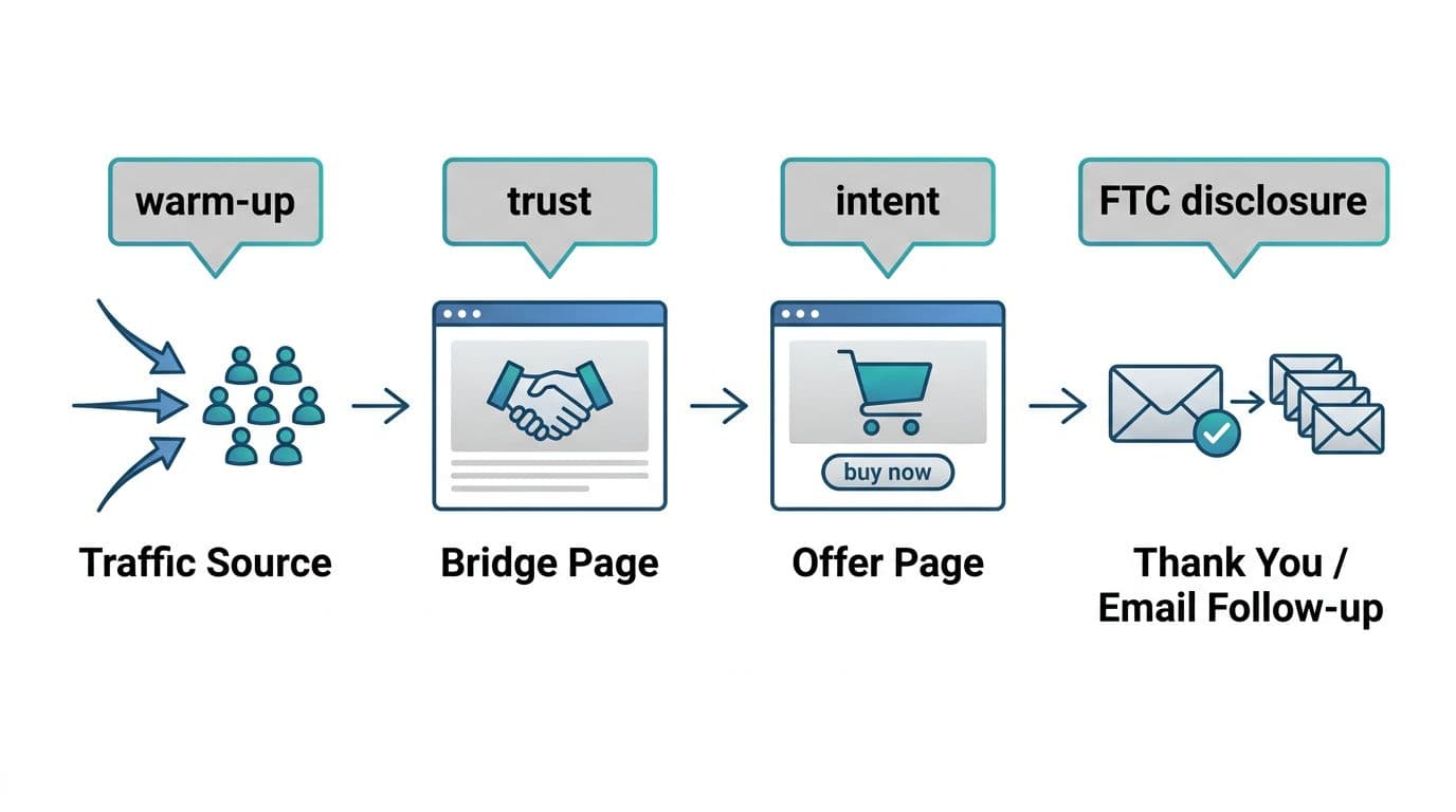
A bridge page, a critical part of a broader bridge funnel strategy, sits between your traffic source (blog post, YouTube, email, social) and the offer. Think of it like a quick “front desk” check-in. It answers the questions people are already thinking: What is this, who is it for, what’s the catch, and what should I do next?
A solid bridge page does three jobs:
- Sets expectations: What they’ll see on the next page, and what happens if they buy.
- Builds trust fast: A short personal note, proof you actually looked at the offer, and clear pros and cons.
- Guides the next step: One main button, no chaos.
What to avoid is just as important. Skip fake urgency, countdowns, and “you’re crazy if you don’t buy” language. Also, don’t write a mini sales letter that repeats the vendor’s claims. If the offer overpromises, your bridge page should not “fix” it with louder hype. By adding value here, you avoid thin affiliate signals that Google dislikes.
If you want a deeper look at why bridge pages can lift clicks when used responsibly, compare perspectives like ClickBank’s overview of an affiliate bridge page presell strategy and this practical walkthrough on how to create a bridge page. Use them for structure ideas, then keep your tone grounded.
For placement, treat the bridge link like a decision point. Make this page part of a larger search engine optimization strategy involving internal linking from relevant blog posts. This guide on the affiliate link placement map is helpful when you’re deciding where that “next step” should appear in your content.
If your bridge page can’t explain the offer in plain words, it’s not a bridge yet. It’s a detour.
The “helpful, not pushy” tone rules that pre-sell naturally
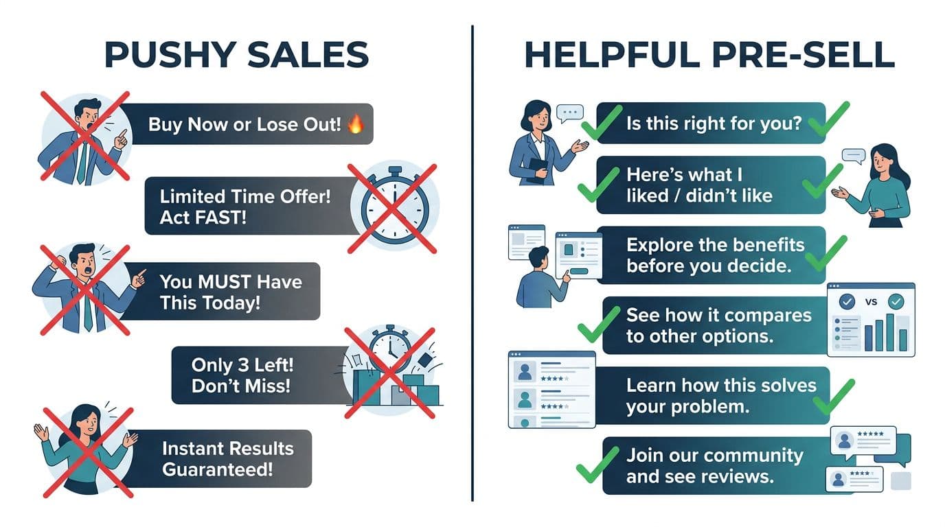
Most bridge pages feel pushy for one reason: they talk like a megaphone. Helpful pages talk like a friend who did the homework.
Use these simple rules to create unique content that boosts user engagement:
Write like a reviewer, not a cheerleader. “Here’s what I liked” sounds human. “This will change your life” sounds rented.
Be direct about your relationship to the offer. Put the disclosure near the top, before the first button. Keep it plain:
Affiliate disclosure (copy/paste): I may earn a commission if you sign up through my link, at no extra cost to you. I only recommend tools I believe can help.
Then add one credibility line that doesn’t brag. For example: “I went through the training and took notes so you don’t have to.”
Also, include a downside. One real con does more for conversions than three extra “benefits.” If you need ideas for lightweight proof that doesn’t slow your page, this post on proof blocks in affiliate posts shows formats that feel believable (short test notes, one screenshot, a quick result). Using modular content blocks helps organize the interaction design of the page so it feels like a personal recommendation rather than a generic ad.
One more tone tip: keep your call to action calm. “See if it fits you” often outperforms “Buy now” for cold traffic.
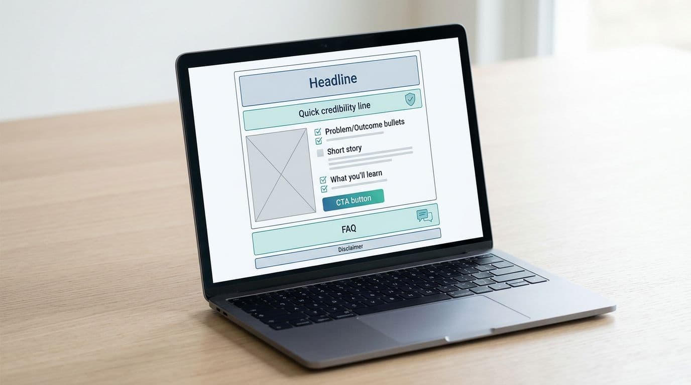
Copy-and-paste bridge page template (with headline and CTA variations)
Use this flexible one page layout as a bridge page template starting point, then swap in your details. It shines as a full width template, offering a cleaner alternative to standard product details pages on e-commerce sites.
Headline (pick one):
- “Before you try [PRODUCT], here’s what to know”
- “Is [PRODUCT] a good fit for beginners? My quick notes”
- “I tested [PRODUCT] so you can decide faster”
- “If you’re trying to [GOAL], this might help (and when it won’t)”
Subhead (one sentence):
In 2 minutes, you’ll know if [PRODUCT] fits your situation and budget.
Disclosure (place here):
I may earn a commission if you sign up through my link, at no extra cost to you.
Quick credibility line (1 sentence):
I reviewed [WHAT YOU DID: demo, free trial, module 1-3, setup steps] and wrote down the parts that matter.
Problem to outcome bullets (3 lines max):
If you want to [OUTCOME #1], [PRODUCT] focuses on [HOW].
If you struggle with [PAIN #1], it helps by [FEATURE/MECHANISM].
If you need [OUTCOME #2], expect [REALISTIC TIMELINE OR EFFORT].
What I liked / didn’t like (honest mini pros/cons):
What I liked: [PRO #1], [PRO #2]
What I didn’t like: [CON #1] (who it affects), [CON #2] (if relevant)
Set expectations with a quick fit check:
| Fit check | This is for you if… | Skip it if… |
|---|---|---|
| Goals | You want [CLEAR GOAL] | You expect “done for you” results |
| Time | You can give it [X] minutes a day | You won’t follow a process |
| Budget | You’re okay with [PRICE RANGE] | You need totally free forever |
| Style | You like step-by-step guidance | You want advanced tactics only |
Tailor this page layouts further by adding a price comparison, merchant link, or contact form as needed.
CTA button (pick one):
- “See what’s included”
- “Watch the free training”
- “Check current pricing and details”
- “Go to the official page”
CTA microcopy (one line under button):
You’ll land on the official site, review details, then decide.
FAQ (2 to 3 short Qs):
“Do I need experience?” [Answer honestly.]
“How long until I know it’s working?” [Give a realistic checkpoint.]
“Is there a refund or free option?” [Only if you can confirm.]
Disclaimer (simple):
Results vary based on effort, skills, and consistency. No earnings are guaranteed.
For broader landing page layout ideas (especially button placement and readability in various page layouts), this set of affiliate landing page best practices can spark design tweaks without changing your tone. Users of specific page layouts might explore qode options for added styling flexibility.
Tracking, mobile speed, and the KPIs that tell the truth
You can’t improve what you don’t measure, but you also don’t need a complicated setup.
Start with UTM parameters so you know where clicks come from (blog vs email vs YouTube). Keep UTMs consistent and readable, and avoid stuffing extra parameters. If you use link shorteners or redirect links, verify they don’t create slow redirect chains.
Track these bridge page KPIs for each traffic source:
| KPI | What it tells you | Healthy direction |
|---|---|---|
| CTR to offer page | Did the page persuade, or confuse? | Up |
| Scroll depth | Did they reach pros/cons and CTA? | Up |
| Time on page | Did they read, or bounce fast? | Up (within reason) |
Also watch a simple “sanity metric”: if CTR rises but refunds spike, your bridge page might be overselling.
Before sending paid traffic, run this short mobile and clarity checklist:
- Speed: Compress images, avoid heavy scripts, keep fonts simple. Check if your WordPress theme supports responsive design and smooth page transitions.
- Tap targets: Buttons are easy to tap, with space around them.
- Above-the-fold clarity: Headline, disclosure, and one CTA are visible fast. Use a sticky header for the merchant link or an anchor ID for quick navigation.
- One primary action: Don’t add three competing buttons.
- SEO basics: Optimize your meta description for long-tail queries and add product schema (even for a WooCommerce product you are promoting) to improve visibility.
- Skimmable sections: Short paragraphs, clear subheads, minimal fluff.
Finally, make sure the offer itself is worth putting your name next to. If you’re unsure, use a vetting process like this affiliate program checklist before you build a whole bridge funnel around it.
Conclusion
This bridge page template functions as a high-converting landing page template because of its low-pressure call to action and honest approach. It doesn’t pressure people, it helps them choose. Keep your disclosure obvious, your pros and cons real. Then track CTR, scroll depth, and time on page so you can improve with proof, not guesses; this data-driven tracking ensures long-term success. If it reads like a helpful note you’d send to a friend, you’re on the right track.