People don’t search “alternatives” because they’re bored. These are bottom of the funnel searches because they’re stuck, the price jumped, a feature’s missing, or they don’t trust the tool anymore. A strong best alternatives post meets that moment with clarity, proof, and an easy next step.
This section-by-section outline gives you a repeatable structure you can use for “X alternatives” content, including swipeable templates, a scoring rubric, and a final checklist. It’s designed to improve content quality so it ranks, but more importantly, it’s built to help readers make informed decisions.
Start with the right “X alternatives” keyword and search intent
The easiest way to miss with alternatives content is to aim at the wrong query without keyword research. “Best X alternatives” signals buying intent, not the same as casual browsing queries like “X competitors,” “X vs Y,” or “free X alternatives.” Each one indicates a different reader mindset and a different page format.
Before you write, pin down three things as the foundation of your SEO strategy for these targeted pages:
First, the primary intent. User intent ties directly to readers’ pain points, such as leaving X because of cost, complexity, missing features, or support. Your intro, comparison table, and pick order should reflect that. A cheap-first list for a feature-gap audience won’t convert.
Second, the expected content format. Alternatives searchers expect quick answers, a scannable comparison, and deeper detail only if they want it. If you bury the table or turn the page into a vague list, the click back to Google happens fast.
Third, the angles you can own. High content quality comes from mapping tools to category keywords or jobs-to-be-done keywords, along with use-case mapping, clear tradeoffs, and citations to pricing pages, docs, and update notes. Thin listicles reuse the same claims across ten sites. Helpful posts show the “why,” not just the “what.” For a practical refresher on writing pages that satisfy searchers, see Ahrefs’ SEO writing steps.
A quick targeting rule that keeps you honest: if your page title says “alternatives,” your H2s and table rows should read like replacement decisions, not a vendor directory.
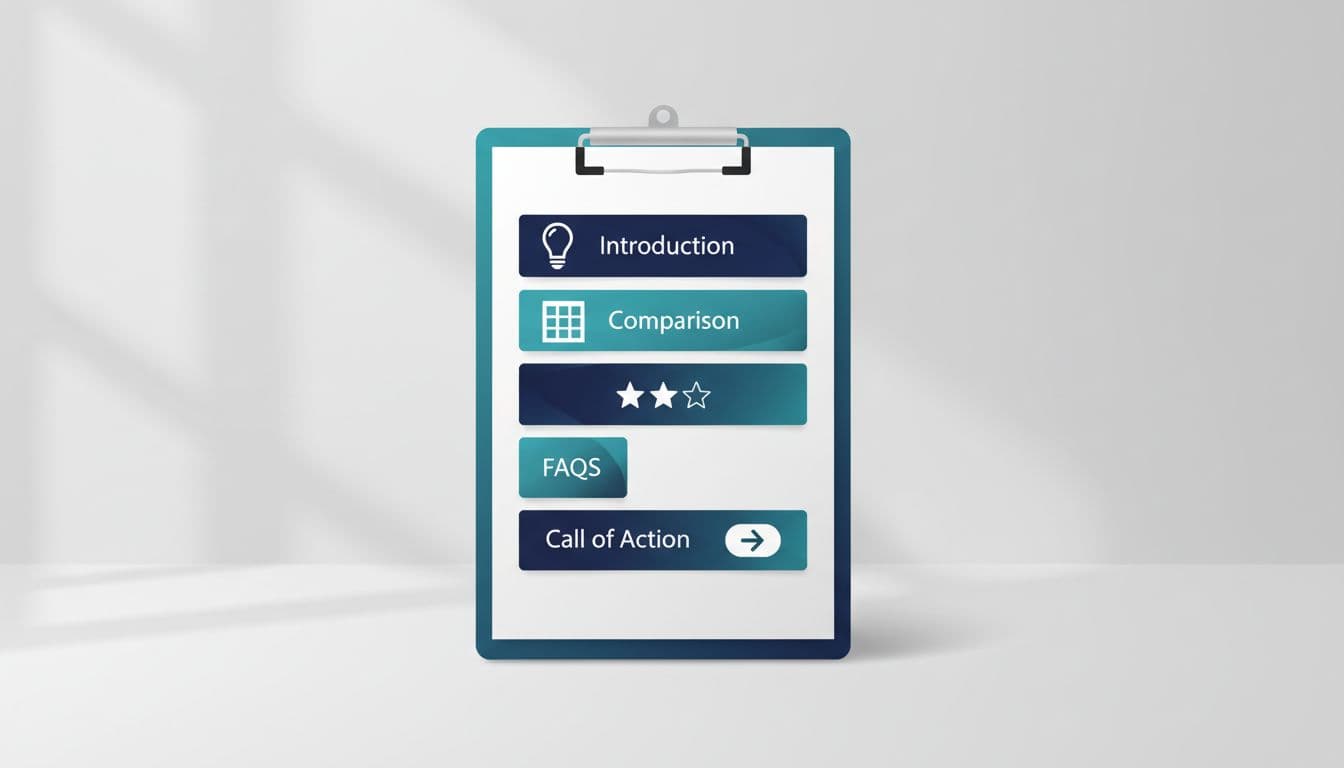
The section-by-section outline (use this every time)

A best alternatives post works because it reduces decision stress for the target audience. A product comparison simplifies their journey. The outline below is designed to do that, section by section.
1) Title that matches the decision
Use a plain promise. Avoid cute titles.
Template options:
- “Best [X] Alternatives (Tested Picks for [Primary Use Case])”
- “[X] Alternatives: [Top Pain Point] Options Compared”
2) Above-the-fold “quick verdict” (5 to 8 lines)
Open with who this is for and what you tested or evaluated.
Swipeable copy:
Quick take: If you want a simpler [category] than [X], start with [Tool A] for [reason]. If you need [power-user need], look at [Tool B]. If budget is the main issue, [Tool C] is the best low-cost pick.
3) Pros and cons of X (and who should still keep it)
This is trust fuel. Mention 3 to 5 common deal-breakers and add a fair note for who shouldn’t switch. Keep it factual and non-snarky.
Mini example (generic SaaS): If “AcmeCRM” is great at reporting but hard to set up, say so. Then your picks can map to “setup-first,” “reporting-first,” and “budget-first.”
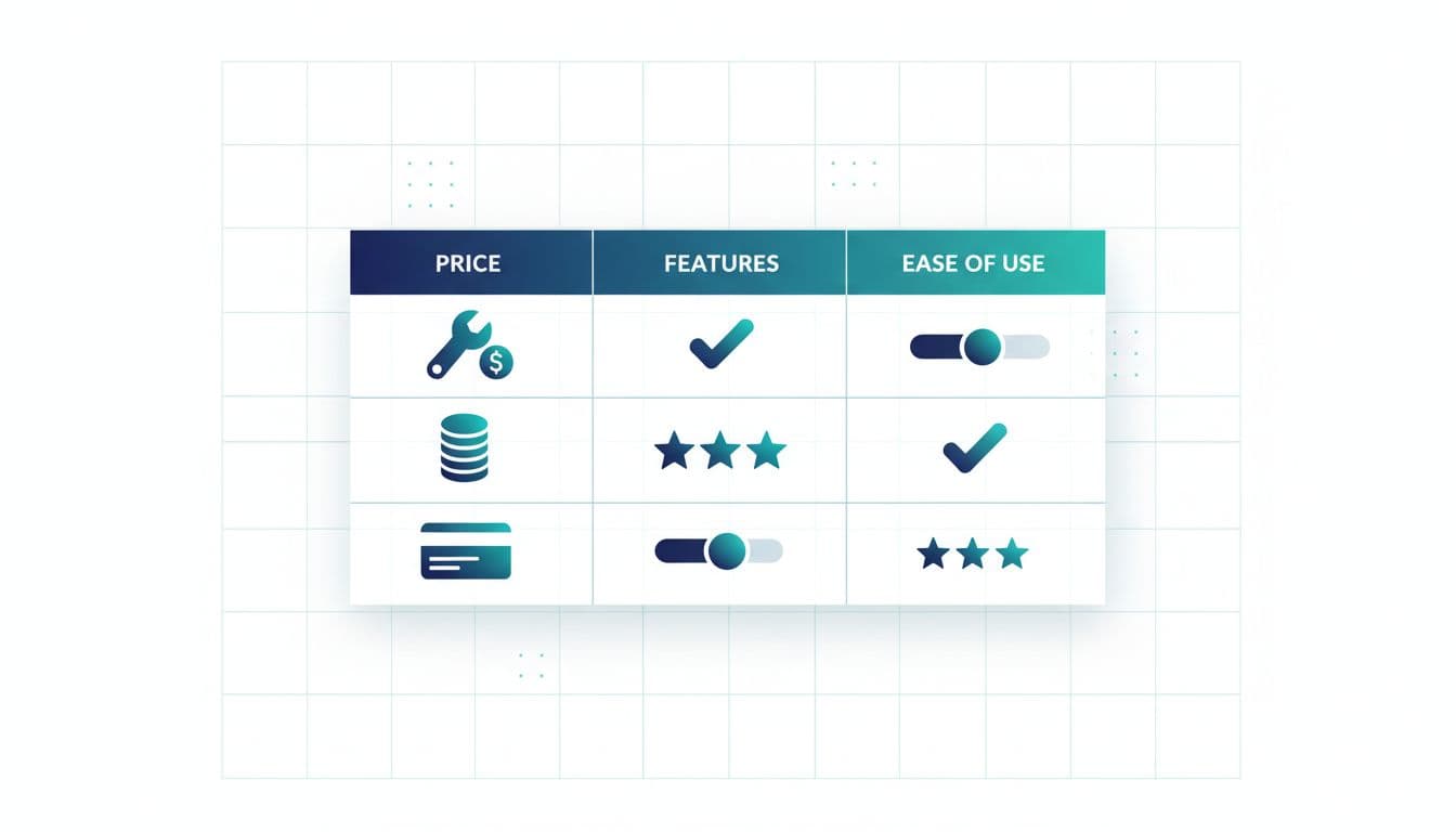
4) Comparison table (early, not hidden)
Put the table before long reviews. It’s the reader’s map.
5) The alternatives list (6 to 10 picks)
Each pick needs a clear “best for” label, proof, and a next step. More on that below.
6) FAQs (answer objections that block the click)
Include pricing, migration, free trials, and “which is easiest” style questions.
7) Final recommendation + CTA block
Re-state the top 2 to 3 picks and give one simple action per pick.
For broader writing guidance that still applies to comparisons, Marketer Milk’s tips on posts that rank and convert are a solid cross-check. Internal linking to these outlines also strengthens the overall site structure.
Build a comparison table that earns clicks (plus a scoring rubric)

Your table shouldn’t be a feature dump. It should mirror how someone chooses.
Practical table rules: Comparison tables are vital for winning featured snippets. Keep columns to the 4 to 6 that matter most, such as pricing breakdown, label rows in plain language, and use consistent values (yes/no, ranges, “good/better/best”). If every cell is “it depends,” the table fails.
Here’s a swipeable table format you can reuse:
| Tool | Best for | Starting price (monthly) | Ease of setup | Key limit | Free trial |
|---|---|---|---|---|---|
| Tool A | Beginners | $ | Easy | Limited automations | Yes |
| Tool B | Teams | $$ | Medium | Higher learning curve | Yes |
| Tool C | Budget | $ | Easy | Fewer integrations | No |
To stop yourself from “vibes ranking,” add a simple scoring rubric. Evaluating tools for specific use cases is a hallmark of content quality. You don’t need perfect math, you need consistency.
| Criteria | Weight | Score 1 (low) | Score 3 (mid) | Score 5 (high) |
|---|---|---|---|---|
| Fit for main use case | 30% | Weak fit | Solid fit | Great fit |
| Ease of use | 20% | Hard | Manageable | Simple |
| Core features | 20% | Missing basics | Most basics | Strong set |
| Price value | 15% | Poor value | Fair value | Strong value |
| Support and docs | 15% | Thin | OK | Strong |
Use the rubric behind the scenes, then reflect it in your “best for” labels and your ordering. For extra on-page writing fundamentals, Elementor’s SEO-friendly writing tips can help tighten headers and readability.
Write alternative reviews that feel tested (not copied)

Readers can smell generic reviews. So can Google. A product vs product approach works best when reviews feel authentic.
Use this repeating block for each alternative, and keep it tight. Adapt it in your unique brand voice to stand out:
Swipeable per-tool template:
[Tool Name] is best for: [one clear persona/use case].
Why it’s a good alternative to [X]: [1 to 2 specific differences that match the pain point].
What you’ll like: [a concrete feature or workflow].
Tradeoff: [one honest drawback].
Pricing snapshot: [what pricing is based on, seats, contacts, usage].
Switching notes: [imports, integrations, setup time].
Try it if: [decision shortcut].
Mini example (generic SaaS): “Tool B is best for teams that need approvals. The tradeoff is setup time. If you’re solo and want speed, Tool A is a better fit.”
For E-E-A-T, add small proof points. Providing specific proof points increases content quality and signals expertise to search engines:
- Mention what you did (set up a test project, ran a sample campaign, imported a CSV).
- Cite sources where claims change often (pricing pages, documentation, release notes).
- Use dates when it matters (pricing as of February 2026).
Add conversion elements and stay compliant (without killing trust)
Best alternatives posts are excellent for lead generation because they capture bottom of the funnel traffic right before purchase, helping increase conversion rate by guiding readers to act, not just browse.
High-converting elements that don’t feel pushy:
- Decision shortcuts: “Pick A if you want the simplest setup, pick B if you need advanced rules.”
- Use-case mapping: one sentence per persona, placed right after the table and again near the end.
- Call to action variety: not every button needs to say “Buy.” Mix “Start a free trial,” “See pricing,” and “View templates,” based on intent.
Affiliate compliance matters most at the top, before links. Use plain language, no legal fog.
Swipeable disclosure:
Disclosure: Some links are affiliate links, which means I may earn a commission if you buy. I only recommend tools I’d use for this job.
Also avoid bait-and-switch CTAs. If you say “free,” send them to an actual free plan or trial page, not a checkout.
Checklist: publish, improve, and avoid thin listicles
Use this before you hit publish:
- The intro names the pain point and the reader type in the first 60 seconds.
- The comparison table appears before long reviews.
- Every alternative has one clear “best for” label and one honest tradeoff.
- Claims that can change (price, limits) are sourced and date-stamped.
- The ordering matches the scoring rubric, not brand familiarity.
- The page answers migration, pricing, and “which should I choose” in FAQs.
- Affiliate disclosure is clear and placed before affiliate links.
- At least one CTA appears above the fold, and another near the end.
- The post adds original value (testing notes, rubric, use-case mapping), not recycled blurbs.
- You have a plan to refresh quarterly (pricing, features, screenshots, broken links, technical SEO), and an effective SEO strategy includes regular internal linking to keep these posts relevant.
- Publishing several of these helps build topical authority in your niche.
Conclusion
A best alternatives post is a vital part of your content marketing plan. It wins when it lowers stress and raises confidence. While LSI keywords help, prioritize satisfying search intent for bottom of the funnel users. Get the buying intent right, lead with a table that actually helps, and back your picks with real reasons and real tradeoffs. Keep the experience honest, add simple decision shortcuts, and your content marketing best alternatives post won’t just rank, it’ll convert readers who are ready to switch.
