

If your “X vs Y” posts aren’t ranking, it’s rarely because you missed a keyword. It’s usually because the page doesn’t help the reader decide. It reads like a brochure, not a verdict.
A strong x vs y comparison post feels like a friend who already tried both options and can explain the trade-offs in plain English. A high-ranking post identifies the primary keyword and aligns with the buyer journey early on. It answers the “Which one should I pick?” question fast, then backs it up with proof.
This playbook gives you a section-by-section content outline you can reuse, plus prompts and example snippets you can adapt in minutes.
Pick the right angle (intent + SERP clues) before you write
Every X vs Y query has a search intent. Some readers are ready to buy today. Others are trying to avoid a mistake. Your job is to match the motive, not just the words.
Start by performing a SERP analysis on the current top results and note three things:
First, format. Are the winners short and punchy with a quick verdict, or long and test-heavy with benchmarks? Match the dominant format for competitor comparison unless you can clearly improve it.
Second, decision drivers. Look for repeated subtopics like “pricing,” “ease of use,” “best for beginners,” “integrations,” “refunds,” “speed,” or “support.” Those repeats are the real ranking signals because they map to what readers care about.
Third, snippet targets. If the SERP shows “People also ask,” a comparison table, or a list-style featured snippet, that’s a hint to add a tight “verdict” block and a scannable table.
If you want a solid refresher on writing that works for both classic search results and AI Overviews, keep Search Engine Land’s guide to writing for SEO and LLMs bookmarked. It offers a strong strategy for Generative Engine Optimization. The big theme is simple: clear structure, clear answers, then supporting detail.
A section-by-section content outline template (copy/paste) with copy prompts
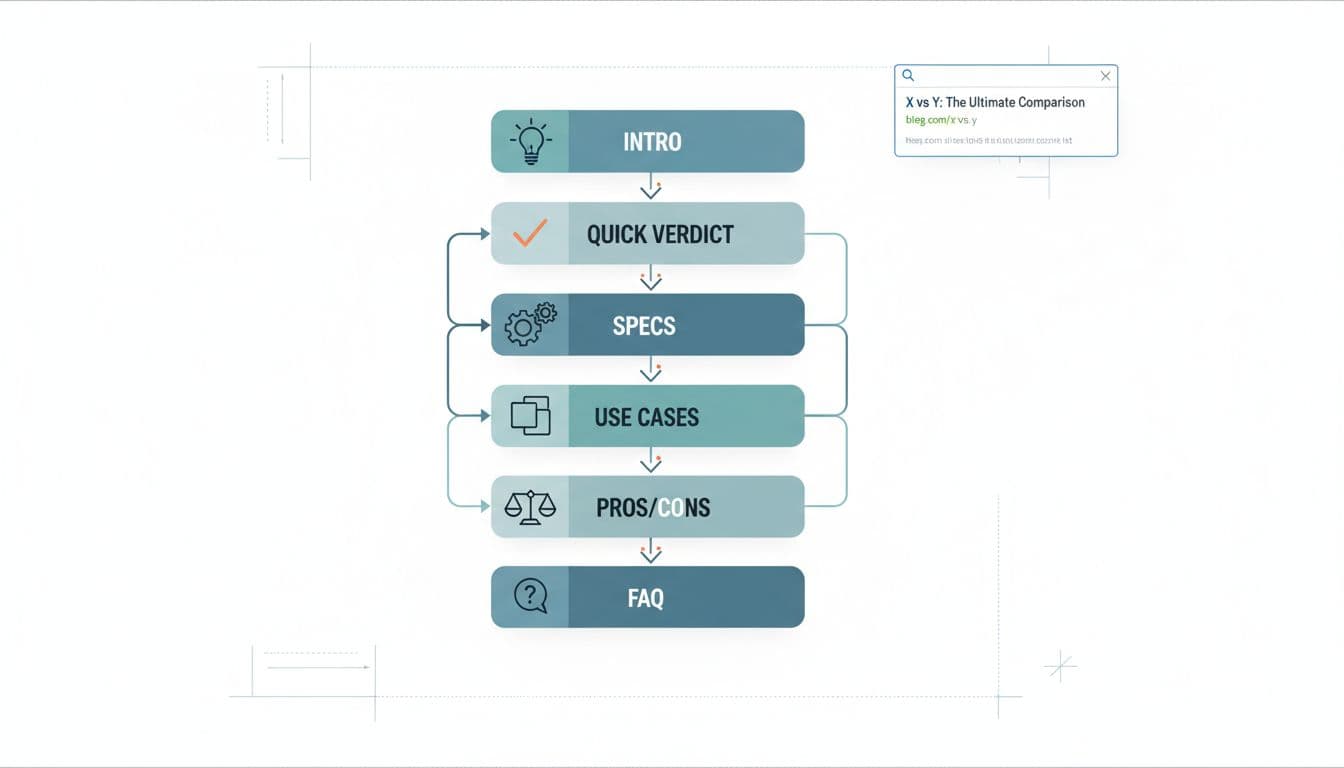
Use this content outline as your default structure, complete with copy prompts as tools for filling it out. It’s built to satisfy skimmers first, then earn trust with detail using strategic H2/H3 headings.
- Title + promise (H1) Prompt: “What’s the real decision?” (Example: “X vs Y: Which is best for [specific use case] in 2026?”)
- Opening (2 to 4 short paragraphs) Prompt: “What situation is the reader in, and what will they decide by the end?”
- Quick verdict (above the fold) Prompt: “If you only read 6 lines, what’s the call?” Include 2 winner statements: “Choose X if…”, “Choose Y if…”
- At-a-glance comparison table Prompt: “What are the 4 to 6 criteria most people use to decide?” (Keep it to decision points, not trivia.)
- How we compared X and Y (your method) Prompt: “What did we test, review, or verify?” Include dates, plan tiers, device used, and what you did hands-on.
- Head-to-head by criteria (H3s under one H2) Prompt: “One criterion per section using H2/H3 headings.” Start each with the outcome, then explain: “Winner: X (because…).”
- Use cases (real scenarios) Prompt: “If I’m [type of user], which should I pick and why?” Add 3 to 5 tight scenarios.
- Pros and cons (honest and specific) Prompt: “What would make someone regret choosing each option?”
- Pricing comparison (and gotchas) Prompt: “What does it really cost over 12 months?” Mention add-ons, limits, and upgrade pressure.
- FAQ Prompt: “What do people ask right before buying?” Answer in 2 to 4 sentences each.
For more examples of comparison formats and section ideas, see Copy.ai’s guide to writing a comparison blog post and adapt what fits your niche.
Copy prompts for scannable content and mini-snippets for the highest-impact sections
The sections below carry most of the click-to-scroll behavior. They form scannable content that readers often skim. Write them like they’re the only parts that will be read, because often they are.
Intro mini-snippet (with placeholders)
You’re choosing between (X) and (Y) because you want (outcome). The tricky part is they look similar on the surface, but they’re built for different types of users. This comparison breaks down where each one wins, what it costs in real terms, and which one fits your situation.
Quick verdict mini-snippet (fast and decisive)
Tip: Include a call to action to drive engagement.
If you want (top priority), pick (X). It’s better for (use case) and you’ll feel the benefit in (timeframe).
Pick (Y) if you care more about (different priority), or you need (specific feature) without extra setup.
Pros and cons mini-snippet (specific, not fluffy)
(X) pros: Strong at (specific strength), fewer steps to (job to be done), better fit for (user type).
(X) cons: Watch out for (limit), pricing jumps if you need (feature), support is slower on (plan).
(Y) pros: Best when you need (strength), works well with (workflow), easier to manage if you have (constraint).
(Y) cons: Can feel limiting for (advanced need), setup takes longer if you want (result).
Add proof, not hype (tables, sources, screenshots, and thin-affiliate traps)
In 2026, a high-quality feature comparison needs more than opinions. If it looks like you skimmed two homepages and dropped affiliate links, readers bounce, and rankings follow.
Build credibility with social proof using simple receipts and visual aids:
| What you claim | What to compare | What to show |
|---|---|---|
| “X is easier” | Setup time, steps, learning curve | 2 to 3 screenshots, a short checklist of steps taken |
| “Y is cheaper” | 12-month cost, required add-ons | Pricing math, plan tiers, a note on limits |
| “X is faster” | Speed, load time, response time | Test results (with date), device and settings used |
| “Better for beginners” | Guidance, defaults, support | Examples of onboarding, help docs, support reply times |
This comparison table provides a direct comparison to help you make informed choices. A few thin-affiliate signals to avoid (without turning your post into a novel): don’t hide behind vague claims (“best,” “powerful”), don’t copy feature lists, don’t put five affiliate buttons before you’ve explained the differences, and don’t skip the “how we compared” section. One strong paragraph about your method can do more than 800 extra words.
2026 Finishing Touches (E-E-A-T, Schema Markup, and CTR)
Your X vs Y comparison post should look like it was maintained, not published and forgotten. Add an “Updated” date when you re-check pricing, features, and UI changes. Include a short author bio that explains why you’re qualified (hands-on use, clients served, results achieved) to build E-E-A-T and deliver people-first content.
Schema markup can help when it matches the page. FAQ section markup fits naturally because comparison posts already answer pre-buy questions. HowTo schema usually doesn’t fit unless you’re teaching a process (like “How to migrate from X to Y”).
Write titles that signal the decision fast. Examples:
- “(X) vs (Y): Which Is Better for (use case)?”
- “(X) vs (Y) for Beginners: Costs, Pros, and Best Pick”
- “(X) vs (Y): The Real Differences (Tested)”
For more structure ideas that often win clicks, skim these SEO blog templates and borrow the “promise + proof” pattern.
Pre-publish checklist
- Title matches search intent and shows a clear outcome (not just “X vs Y”).
- Quick verdict is visible without scrolling on mobile.
- Comparison table uses decision criteria, not filler features.
- Claims are backed by screenshots, sources, or your own test notes.
- H2/H3 headings are unique, incorporate long-tail keywords, and match what people scan for in SERPs.
- External links support key facts, and affiliate links aren’t stacked above the value.
- FAQ answers are short, direct, and match real questions from SERP “People also ask.”
- Images are compressed, page loads fast for optimal user experience, and layout doesn’t jump while loading.
- Internal linking connects to relevant guides and resources.
- Meta descriptions entice clicks and align with page content.
Conclusion
A ranking comparison post isn’t a longer post, it’s a clearer one. Lead with the verdict in an inverted pyramid structure, compare what matters, and show your work. When your page reads like a real decision guide that satisfies search intent, it earns trust from readers, sends the right signals to search systems, and builds topical authority. Publish one x vs y comparison post using this outline, then update it after 30 days based on what readers click and where they drop off.