
A review post can lose the click before the reader reaches the second scroll. That happens when the top of the page is vague, crowded, or too eager to sell.
An affiliate above-the-fold audit fixes that first impression. In 2026, readers want proof fast, trust signals early, and a page that fits their intent without making them work for it.
The first screen has to answer three questions
The top of a review post should answer a simple set of questions right away: what is this, who is it for, and why should I trust it? If the reader has to hunt for those answers, the page feels weak.
That first screen is not the place for a long brand story. It is the place for clarity. The headline should name the product and the use case. The opening lines should say what the review covers. The visual should support the decision, not distract from it.
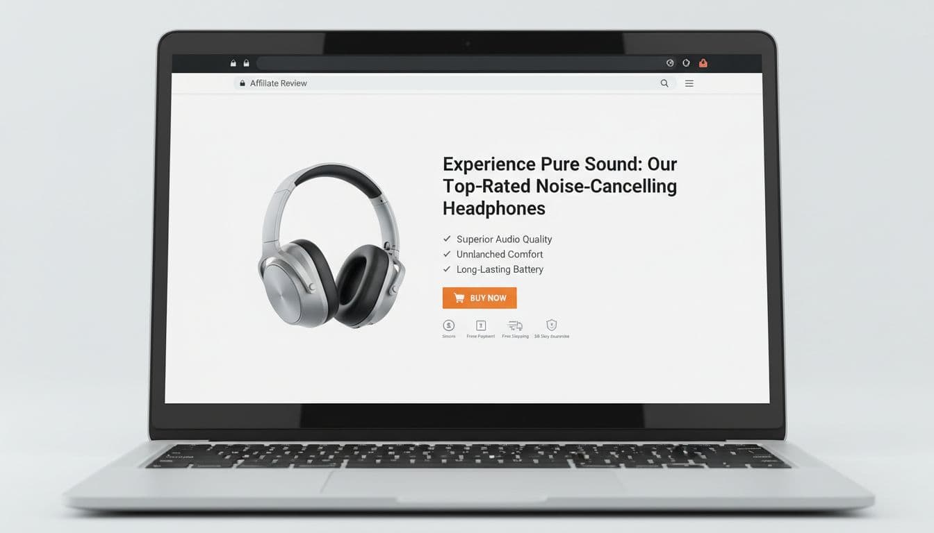
A strong top section usually includes four things. First, a clear product or comparison headline. Second, a short verdict or summary line. Third, one visible trust signal, such as first-hand testing, a named author, or a direct disclosure. Fourth, a next step that matches the page intent.
Google’s 2026 quality signals reward pages that feel real, useful, and human. A useful reference is this on-page SEO checklist for affiliates, which reinforces clear headings, honest pros and cons, and visible trust details.
If the top of the page feels vague, readers assume the rest of it will waste their time.
Strong and weak above-the-fold setups, side by side
A good audit is easier when you compare the weakest version with the best version. The difference is rarely subtle. It often comes down to order, clarity, and restraint.
| Element | Weak setup | Strong setup |
|---|---|---|
| Headline | Generic title with no clear use case | Product name plus benefit or buyer type |
| Summary | A few sales lines with no substance | One short verdict based on real use |
| Proof | Hidden below the fold | Visible test note, author name, or result |
| CTA | Several buttons fighting for attention | One clear next step |
| Visuals | Cluttered product shots and ad blocks | One useful image that helps scanning |
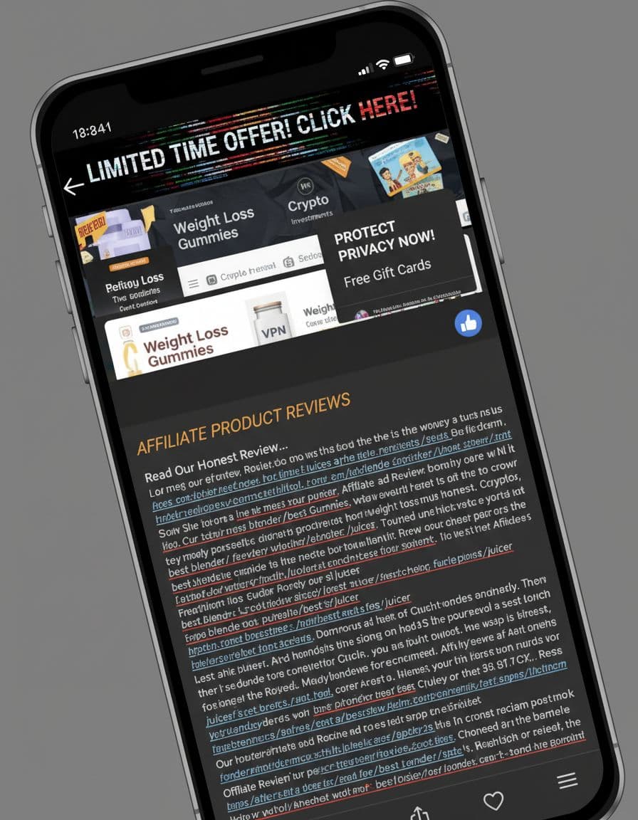
In practice, the strong version feels calm. It gives the reader one path forward. The weak version feels like a hallway full of signs.
You can see this in product reviews and comparison posts. A clean hero section works because it reduces doubt. A messy one increases it. Readers do not need more persuasion at the top. They need less friction.
For pages that depend on images, pair your layout check with affiliate image SEO checklist. Good visuals now help with trust, scanning, and how the page feels on first load.
Mobile is where most audits fail
Desktop previews can hide problems that mobile shows right away. On a phone, the first screen gets smaller, tighter, and far less forgiving. A clean desktop hero can still become a mess on mobile.
That is why a mobile-first audit matters. The headline needs to stay readable without zooming. The summary should fit into a few short lines. Buttons need enough space to tap easily. Ads should not push the core message down the page. Most of all, the content should still feel like a review, not a billboard.
The easiest mobile fixes are often simple. Remove extra badges that do not help the choice. Keep one primary call to action. Make sure the disclosure is visible without hunting. If the page uses an image, it should load quickly and stay legible on a narrow screen. Review posts lose trust fast when the layout feels cramped.
A useful companion to this is affiliate link density for review posts, because link crowding often shows up first on mobile. Too many links near the top can make the page feel noisy and push the real content out of view.
Trust and compliance need to show up early
2026 review pages need more than a polished layout. They need visible proof that a real person made the recommendation. That starts above the fold.
Readers want to know who wrote the review, whether the product was tested, and whether the page is trying to sell them something without saying so. A short author line can help. So can a brief test note, a visible disclosure, and a verdict that includes a downside. When those details appear early, the page feels honest.
The best top sections do not hide the commercial side. They make it clear and controlled. A disclosure near the top is cleaner than a buried one. A single affiliate button is easier to trust than five scattered links. A short “what I liked” line plus one real drawback often builds more confidence than a polished sales pitch.
For recent update context, this March 2026 affiliate site audit guide is a useful reference. It ties trust, authorship, and CTA review to the current direction of search quality work.
A disclosure hidden below the fold is a trust leak, even when the rest of the page looks strong.
A quick audit checklist you can use today
Before you publish or refresh a review page, scan the first screen and ask if it passes a fast shopper test. If the answer is no, the page needs work.

Use this as a quick pass:
- The headline names the product and the main outcome.
- The opening sentence says who the review is for.
- The top section includes one real trust signal.
- The disclosure is visible without scrolling.
- The primary CTA matches the reader’s intent.
- The mobile view stays readable and uncluttered.
- The first image supports the decision, not the decoration.
If two or more items fail, the above-the-fold area is working against you. Fix that before you tweak button colors or headline word order. The first screen carries the weight of the page.
For comparison posts and higher-intent review pages, affiliate site CRO changes for 2026 can also help you think about CTA placement and headline clarity.
Conclusion
A strong review post does not try to impress the reader with noise. It earns attention with clarity, proof, and a layout that makes sense in seconds.
The best affiliate above-the-fold audit in 2026 is simple to run and hard to fake. If the first screen shows the product, the promise, the proof, and the disclosure, the rest of the review has a chance to do its job.