
Large review sites don’t fail because they lack pages. They fail because the pages that matter are buried too deep. An affiliate HTML sitemap gives users, and crawlers, a cleaner way to reach your best category hubs, comparison pages, and reviews.
In 2026, that matters more than it did a few years ago. Search systems are better at ignoring noisy pages, so a sitemap only helps when it points to real value. A good one is a curated map, not a junk drawer.
What an HTML sitemap should do for a large review site
An HTML sitemap has one job, make your site easier to move through. It should help a visitor find the right hub in seconds, and it should reinforce your internal linking plan. It is not a place to dump every URL you own.
Google’s sitemap guidance still applies here, because XML is what you submit for discovery and reporting. The HTML version lives on the site and helps people, which is why the best pages are short, clear, and tightly grouped. If your sitemap feels like a file export, it needs another pass.
Large affiliate sites also need a sharp divide between helpful depth and noisy depth. Pages with real intent deserve a spot. Pagination, tag archives, and thin filters usually do not.
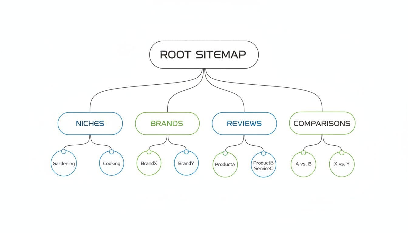
Build the sitemap around categories, brands, and buying intent
Start with the way buyers search, not the way your CMS stores content. A review site usually works best when the top level is built around categories or use cases, then brand hubs, then buying guides, comparisons, and single reviews.
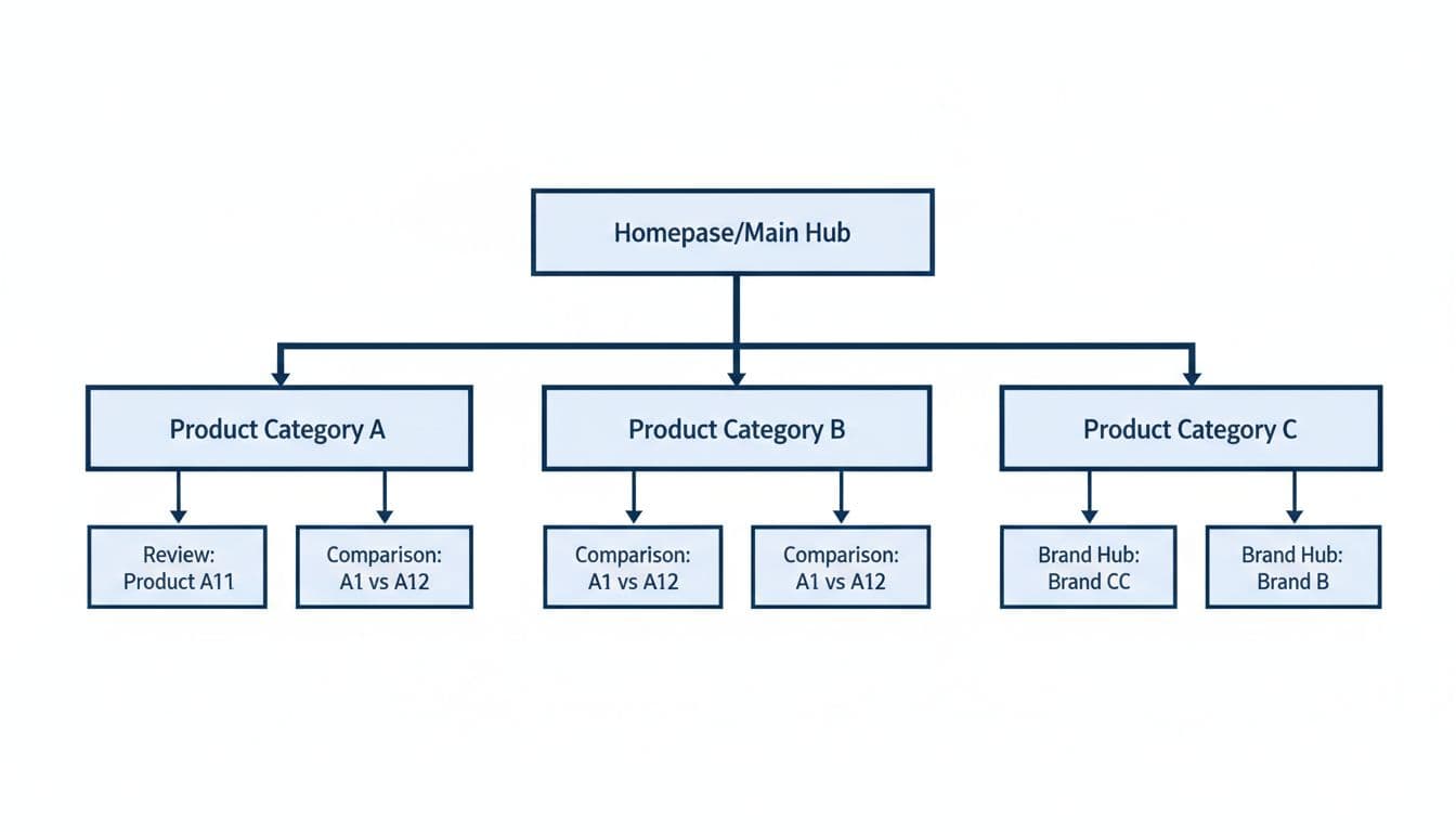
For example, a home office review site might group pages like this:
| Sitemap section | Include? | Why it belongs |
|---|---|---|
| Category hubs | Yes | They collect related reviews under one clear theme. |
| Brand hubs | Yes | They help users compare products from the same maker. |
| Comparison pages | Yes | They catch high-intent “vs” searches. |
| Best-of pages | Yes | They match the highest commercial intent. |
| Single product reviews | Yes, for core products | They support users who already know the brand. |
| Tag pages and search results | No | They add clutter without much value. |
That structure keeps the sitemap readable. It also mirrors how people shop. If someone lands on the sitemap page, they should see a clean path, not a random archive.
A sitemap is a map, not a content dump. If it starts looking like one, it has gone too far.
Pages to include, and pages to leave out
The fastest way to weaken an HTML sitemap is to treat every indexable URL the same. Search Engine Land’s HTML sitemap best practices makes the point clearly, only list URLs visitors can use.
Use a simple filter when you decide what stays:
- Keep canonical pages that answer a real buyer question.
- Keep cornerstone hubs that sit above a cluster of reviews.
- Keep comparison pages that help a reader choose fast.
- Remove thin archives that repeat the same topic with little added value.
- Remove expired deals, old coupon pages, and dead promo posts unless they still drive traffic.
- Remove filter and sort URLs that create endless versions of the same page.
That keeps the sitemap useful and keeps low-value pages from sitting next to pages you want crawled. For large review sites, this matters because crawl attention is finite. If a page has no chance of helping a reader, it doesn’t belong in the sitemap.
One useful rule is simple. If a page would not feel useful in a footer directory, leave it out of the HTML sitemap too.
Use the sitemap to strengthen crawl paths
The sitemap page should not carry the whole link strategy on its own. It works best when it sits beside strong contextual links from hubs, comparison posts, and reviews. That is where crawlers find meaning, and where users move next.
If your clusters still feel messy, the hub-and-spoke linking strategy is a good fit. It shows how to connect a broad hub to the pages that deserve clicks, which is exactly how a large review site should funnel attention.
This is also where content quality and site quality meet. Put your best review pages within a few clicks of the homepage. Use descriptive anchor text. Refresh the links when a category changes. If a comparison page is the one that closes sales, it should be easy to reach from the sitemap and from related hubs.
For sites with lots of original product photos or comparison graphics, the affiliate image SEO checklist is a smart companion piece. Images don’t fix bad structure, but they do help strong pages earn more value when the rest of the setup is clean.
Conclusion
Large review sites win when the path is obvious. A strong affiliate HTML sitemap gives users a clear route, while your internal links do the heavier work of guiding crawl flow.
The best version is selective, structured, and boring in the right way. It lists the pages that help people choose, and it skips the pages that only add noise. That is what makes it useful in 2026, when search systems reward clarity far more than bulk.