
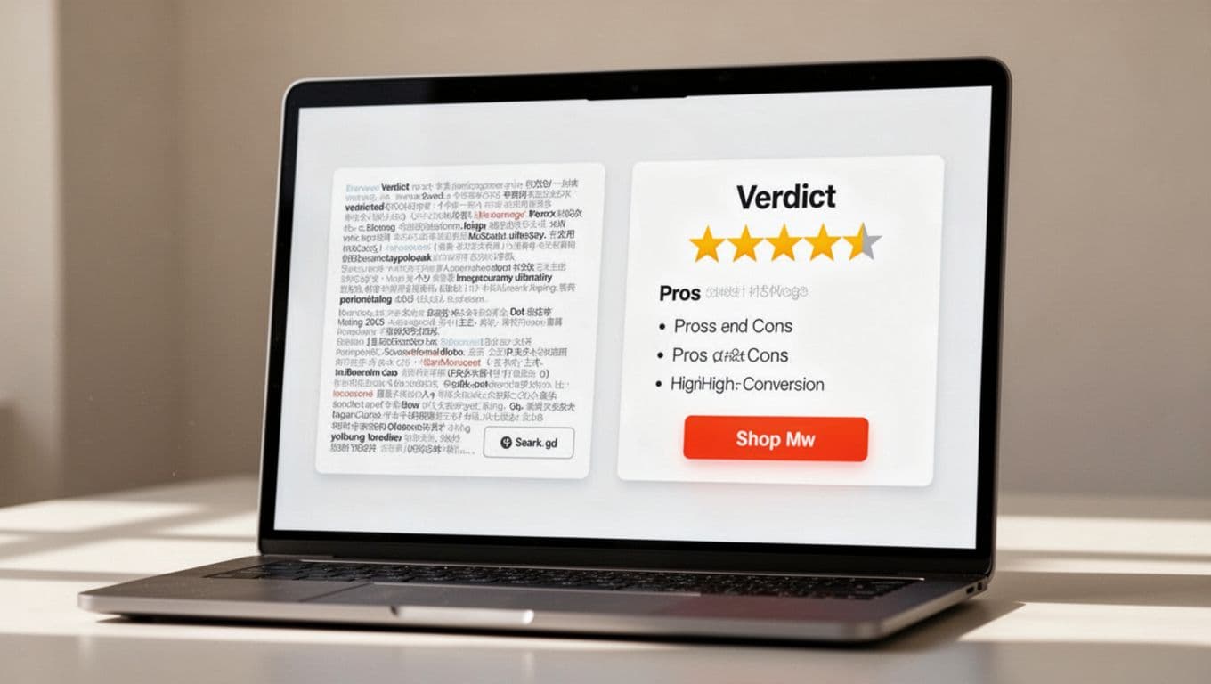
Most review posts don’t lose clicks because the product is weak. They lose clicks because the decision point is weak. A sloppy affiliate review verdict box makes readers stop, doubt, and leave.
A strong box does the opposite. It gives the right reader a fast answer, shows real tradeoffs, and makes the next step feel safe. When it’s easy to scan on mobile, clicks usually rise without pushing too hard.
This video is a useful reminder that honest review content beats hype.
Why most verdict boxes fail, and how to fix them
Most verdict boxes fail because they try to close the sale before they help the reader decide. They pile on praise, skip the downsides, and hide the actual fit. That makes the box feel like an ad, not a recommendation.
Readers want a quick answer to one practical question: “Is this for me?” So your box should lead with fit, not fluff. Show the verdict, the rating, the ideal user, the main benefits, and one clear CTA. If the rest of your review also feels loose, this high-converting product review structure helps tighten the page around it.
Too much text also hurts clicks. A verdict box isn’t a mini review. It’s a summary card. Keep it tight, usually under 180 words. Use short bullets, strong spacing, and one primary button. When readers have to work, they postpone the click.
Trust matters just as much. Include at least one real drawback. Pair your CTA with a visible disclosure. Match button copy to buying intent. “Check current price” or “See current details” feels safer than “Buy now” when readers are still comparing options. For another angle on trust-first layouts, this affiliate product review template is a useful reference.
Mobile design is where many boxes break. Put the verdict, rating, and best-fit line first. Then stack the benefits, pros and cons, and button in that order. Full-width buttons work well on phones because thumbs beat tiny targets every time.
The best verdict box helps the right reader click faster, and it helps the wrong reader opt out without feeling tricked.
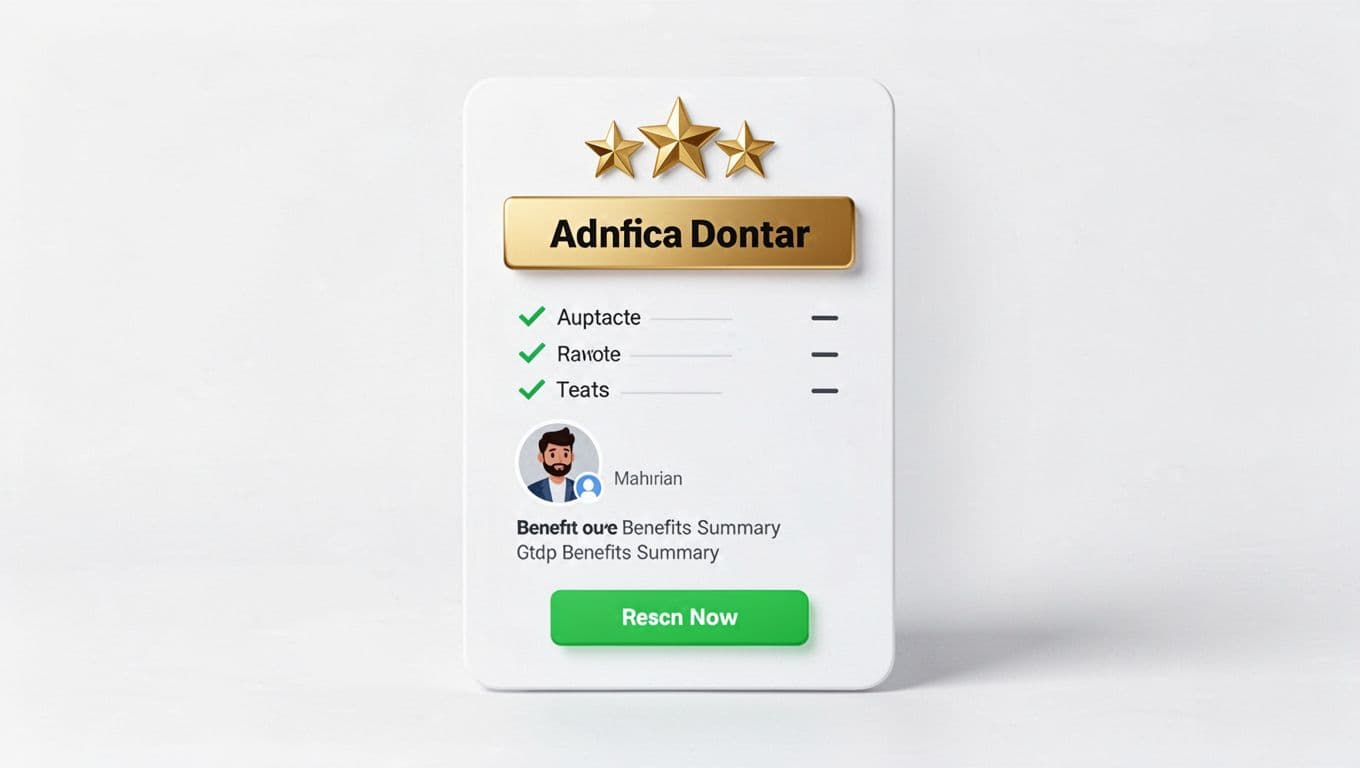
A reusable affiliate review verdict box template
Your box should feel more like a decision helper than a sales banner. Keep the copy plain, short, and specific. If you can’t explain the fit in one sentence, the box is still too vague.
Copy-and-paste template
Use this structure inside your verdict box:
| Element | Sample copy |
|---|---|
| Verdict headline | Recommended for beginners who want a simple start |
| Rating | 4.6/5 based on ease of use, value, and support |
| Best for | New affiliate marketers, bloggers, and niche site owners |
| Key benefits | Fast setup, beginner-friendly lessons, helpful support |
| Pros and cons | Pros: easy start, clear steps. Cons: limited fit for advanced users |
| CTA button | Check current details |
| Disclosure | I may earn a commission if you join through this link |
Sample verdict box copy readers can adapt
Verdict: A strong pick for beginners who want to launch an affiliate site without a long setup process.
Rating: 4.6/5
Best for: New bloggers and side hustlers who want step-by-step guidance.
Top benefits: Quick setup, easy training, and a clear path to your first review post.
Watch-outs: Less useful if you already have advanced tools and a full content system.
Next step: Check current details
Disclosure: I may earn a commission if you buy through my link, at no extra cost to you.
That template works because it blends persuasion with proof. The rating gives a quick quality signal. The “best for” line pre-qualifies the click. The drawback protects trust. The CTA stays calm.
Keep the button copy tied to intent. For cold traffic, softer CTAs often win because they lower pressure. Good examples include “Check current price,” “See current features,” and “Read today’s offer.” If you need help placing trust notes near boxes and buttons, these affiliate disclosure examples are easy to adapt. If you prefer a plugin-based build, Affiliatable focuses on comparison tables and verdict-style boxes, but the copy still matters more than the layout tool.
Checklist for a verdict box that boosts clicks without hurting trust
Before you publish, run this quick check:
- The rating is clear, and it has context behind it.
- The box names the ideal user in plain language.
- It also says who should skip the product.
- Key benefits focus on outcomes, not feature jargon.
- Pros and cons both appear, even if the cons are short.
- The CTA tells readers what happens next.
- A disclosure sits near the link or button.
- The box looks clean on mobile, with short lines and a tap-friendly button.
- The page includes one trust signal, such as a test note, date updated, refund note, or support detail.
Ethical persuasion is the goal here. You want qualified clicks, not random taps. A click from the wrong reader may raise refunds, complaints, and lost trust later. That’s why a verdict box should filter as much as it persuades.
It also helps to vet the offer before you write the review. If the product has weak tracking, vague terms, or a bad refund setup, the best box won’t save it. This affiliate program vetting checklist is a smart step before you build review content around any partner.
A verdict box works when it feels like a shortcut, not a shove. Clear fit, honest tradeoffs, calm CTA copy, and mobile-friendly design do more for clicks than louder copy ever will.
When readers can scan your affiliate review verdict box in seconds and still trust what they see, the click feels earned. That’s the kind of conversion lift that lasts.