
Most affiliate review posts lose readers on a phone before the offer gets a fair look. Tiny buttons, cramped tables, and long blocks of text push people away fast. This mobile UX checklist adopts a mobile-first design philosophy to fix those issues.
It creates a seamless user experience for review sites, keeping the page easy to scan, easy to trust, and easy to tap. The checklist works best for posts that need both rankings and conversions, especially when readers compare options on a small screen.
Key Takeaways
- Start with one clear job: deliver the short verdict, user fit, and next action above the fold to earn the scroll.
- Use stacked cards or accordions for comparisons, keeping key specs like price and ratings visible at a glance without horizontal scrolls.
- Make product boxes thumb-friendly with one primary CTA, ample padding, and no competing links.
- Show trust signals early with clear disclosures, author details, and honest pros/cons to build credibility without clutter.
- Always audit on a real phone: test load speed, taps, and scrolls to catch friction before launch.
Start with the job of the page
Every review post needs one clear job on mobile, help the reader decide faster. If your page tries to educate, rank, compare, and sell all at once, the first screen gets messy. That often kills the click before the reader reaches your main point.
Start the onboarding process for your reader with the short version of the verdict, using familiar navigation patterns to help them find it without getting lost. Then give one or two proof points, such as the user persona it fits and why it stands out. If your review sits inside a broader affiliate site, this is also where the reader should feel they are in the right place, so a link to online money making opportunities in 2026 can make sense when the article needs broader context.
A good mobile summary box should answer three questions fast:
- What is this?
- Who is it for?
- What should I click next?
Leave the deeper details for later. On a phone, clarity beats cleverness every time.
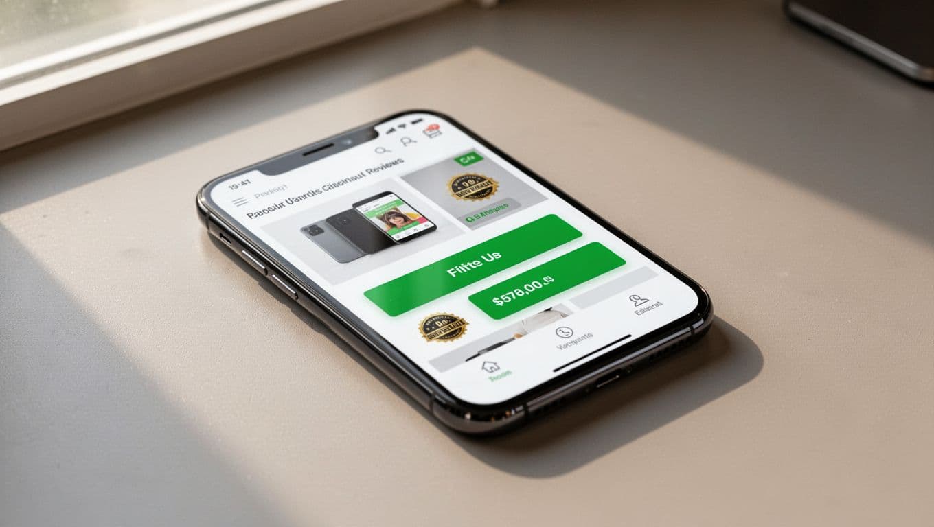
Make the first screen earn the scroll
Above the fold is where mobile pages win or lose attention. Establish visual hierarchy with a short title, rating close to the verdict, and main CTA that appears without hunting. If the reader has to pinch or zoom, responsive web design has already failed.
Keep the summary box simple. Use one product image, one short verdict, and one primary button. If you add badges, keep them small and meaningful, such as “Best for beginners” or “Updated May 2026.” Any more than that turns into noise.
A few useful rules:
- Put the verdict near the top, not buried after three paragraphs.
- Use one accent color for the main button.
- Keep secondary links lower on the page.
Don’t stack three promotional boxes above the fold. That looks crowded on a phone and makes the page feel pushy. A cleaner opening also helps readers trust the review because it feels like a recommendation, not a sales poster, which leads to improved conversion rates.
Build comparison tables that don’t make phones
The classic desktop table is a problem on mobile. Columns shrink, numbers blur together, and readers stop comparing. Good interaction design means a table on a small screen should behave more like a set of cards than a spreadsheet.
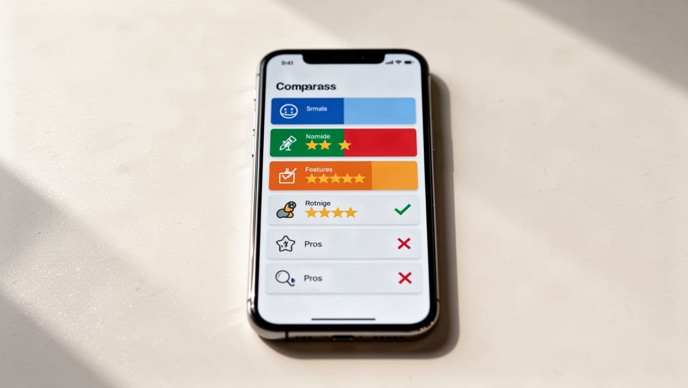
Use the table for quick decisions, not for every feature. To reduce cognitive load, keep each row focused on one buying factor, such as price, best use case, or standout feature. Accordion rows work well when the list gets long, because the reader can expand only what matters.
| Mobile format | Best use case | Watch out for |
|---|---|---|
| Stacked cards | Short product lists | Too much repeated text |
| Accordion table | Longer comparison posts | Hidden content if labels are vague |
| Horizontal scroll | Rare edge cases | Requires gestures and swipes that are easy to miss and awkward to use |
The best choice is usually stacked cards or accordions. Horizontal scroll should stay a fallback that accommodates gestures and swipes, not the default. If the reader has to swipe back and forth to compare products, the page is doing too much work for them.
A few practical tips help here:
- Keep headers short.
- Show the winner first.
- Repeat the key spec inside each card.
- Use icons only when they are obvious.
- Keep price, rating, and one takeaway visible at a glance.
- Check table readability for dark mode users.
Write product boxes people can tap with one thumb
Product boxes should feel easy, not crowded. A good box uses spacing, contrast, and one clear action. On mobile, the touch targets must be large enough for a thumb and far enough from nearby links.
The main button text should say what happens next, like beginning the checkout process. “Check price” or “See official offer” is clearer than vague labels. Position the primary CTA button in the thumb zone, and if your page has more than one CTA, give the secondary action a quieter style, such as a text link below the box.
This is also where many affiliate pages lose conversions. The box has too many links, the image is tiny, or the button sits below a wall of text. If that sounds familiar, use affiliate conversion troubleshooting as a guide after the layout is cleaned up.
Use this quick box check:
- One primary CTA per box.
- Enough padding around the button.
- Product name, price, and verdict visible without scrolling.
- No competing links inside the same box.
Do not make the user work to find the action. If they need to zoom in before tapping, the box is too small.
Keep trust signals visible without crowding the page
Trust on mobile comes from small things done well. User research shows readers want to know who wrote the review, how the product was tested, and whether the site has a financial stake in the link. If those details are hidden, the page feels vague.
Put the disclosure near the first affiliate link or near the top of the post. Keep it plain and short. Clear, visible disclosures align with standard human interface guidelines for mobile software. Then support it with real review details, such as what you tested, what type of user benefits most, and where the product falls short. That sounds simple because it is.
A disclosure works best when it reads like part of the review, not a legal notice pasted into the page.
Also, avoid fake urgency. Mobile readers can spot it fast. Phrases like “only today” or “limited spots” need proof, or they should go. Honest language performs better because it lowers doubt. Honest pros/cons sections better match actual user behavior on mobile devices.
A clean trust section usually includes:
- Clear disclosure text.
- A named author or reviewer.
- An update date.
- A short pros and cons snapshot.
- One line about who should skip the product.
If the article helps beginners, a natural link to do affiliate marketing the right way can reinforce the same honest tone. The point is simple, readers click when the page feels straight.
Speed and mobile SEO checks that affect clicks
Fast pages keep more readers, optimizing load time as a key factor in mobile SEO, but speed also affects how a review feels. Slow image loads, bouncing layouts, and heavy scripts make a page seem broken. On a phone, that can cost the sale before the pitch starts.
Trim what gets in the way. Compress review images, lazy-load media below the fold, and keep the first screen light. If you use comparison widgets or embedded media, test them on a mid-range phone, not just on your laptop; include subtle microinteractions, such as button color shifts on tap, to improve the page feel. A page that looks fine on desktop can feel clumsy on a smaller screen.
Use this mobile SEO check before publish:
- Text is readable without zoom, following accessibility guidelines.
- Buttons sit far enough apart, per accessibility guidelines.
- The page doesn’t jump when images load.
- Product names, H2s, and summary copy match search intent.
- Internal links, tucked into a hamburger menu for non-essential site links, open into useful next steps, not random extras.
The words on the page matter, but the layout does too. Searchers often skim the snippet, open the page, and decide in seconds whether it feels helpful. If your structure makes that decision easy, the rest of the content has a better chance to work.
Run a live-page audit before you publish
Before a review post goes live, perform usability testing on an actual phone. Desktop previews and early-stage wireframes or prototypes hide problems. Your thumb, your screen size, and your browser cache all change the experience.
Use this order:
- Read the opening summary with no scrolling.
- Tap the main button once with one thumb.
- Compare two products side by side.
- Check the disclosure near the first affiliate link.
- Scroll past the first image and make sure nothing jumps.
- Reload the page on mobile data, not Wi-Fi.
If one step feels awkward, identify those friction points and fix the layout before you polish the copy. That small habit saves time later and keeps the whole post easier to use. This quick usability testing ensures real-world performance.
A useful rule is simple: if the task success rate is high for readers to understand the verdict, compare the options, and tap the offer without friction, the page is ready. If any of those steps fail, the page needs another pass.
Frequently Asked Questions
What should the first screen of a mobile review post include?
The first screen needs a short title, rating near the verdict, one product image, and a single primary CTA button. Keep it simple to avoid crowding, using visual hierarchy and one accent color for the button. This earns the scroll and boosts trust from the start.
How do you format comparison tables for mobile?
Opt for stacked cards or accordion rows instead of traditional tables or horizontal scrolls. Focus each row on one buying factor like price or best use case, with icons only if obvious and key specs repeated for quick scans. Show the winner first and test for dark mode readability.
Why are touch targets important in product boxes?
Touch targets must be thumb-sized with enough padding to prevent mis-taps, positioned in the easy-reach zone. Use clear button text like “Check price” or “See offer,” with one primary CTA per box and secondary links quieter below. This reduces friction and improves conversions.
How do you add trust signals without overwhelming the page?
Place a short, plain disclosure near the first affiliate link or top, plus author name, update date, and pros/cons snapshot. Avoid fake urgency and make it read like part of the review. Honest details match user expectations and encourage clicks.
What’s the best way to test a mobile review page?
Run a live audit on an actual phone: read the summary without scrolling, tap buttons with one thumb, compare products, check disclosures, and reload on mobile data. Fix any jumps or awkward spots before publishing. High task success for verdict, comparison, and CTA means it’s ready.
Conclusion
A strong review page on mobile feels calm. It gives the verdict early, keeps tables readable, makes buttons easy to tap, and shows trust signals without clutter. This mobile UX checklist sets your affiliate review posts up for success in mobile commerce.
When you review your next post, walk through the page like a hurried reader with one hand free. That test will show you more than a desktop preview ever will.
The best mobile UX for affiliate content is the kind readers barely notice because it gets out of their way. User experience stands as the deciding factor for success in mobile commerce, where seamless designs drive higher conversions and revenue.