
When someone searches for an integration page, they are not browsing casually. They want to know whether two tools work together, how hard setup feels, and whether the result is worth their time.
The best SaaS integration pages answer those questions fast, then move the visitor toward a signup, demo, or live connection. If the page sounds broad or generic, both search engines and buyers lose interest.
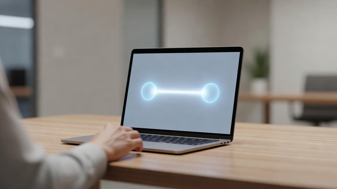
The pages that win in 2026 do one thing well. They make the connection obvious and the next step simple.
Start with search intent, not a feature list
Search intent decides almost everything on an integration page. A visitor who types “HubSpot integration” wants different proof than someone searching “best CRM integrations for Slack” or “how to sync deals to Slack.”
Pages that attract bottom-of-funnel organic traffic usually match a narrow query. They use the app names, the action, and the outcome in the title, H1, and first screen. That gives search engines a clear topic and gives readers a reason to stay.
If the page tries to cover every use case at once, it gets fuzzy. That fuzziness hurts rankings, clicks, and conversions.
A simple structure helps the page feel focused:
| Page area | What it must answer | Sample copy |
|---|---|---|
| Hero | What connects, and why it matters | Connect HubSpot and Slack to surface deal updates in real time. |
| Subhead | How hard setup feels | No code setup, live in minutes. |
| How it works | What happens after connect | Choose a trigger, map the field, turn on sync. |
| Use cases | Why the integration matters | Sales, support, and ops can work from one source of truth. |
| Proof | Why the reader should trust it | Used by teams that want fewer manual updates and fewer missed handoffs. |
| FAQ | What could still block action | Does it work both ways? How secure is it? Can I pause sync? |
If the first screen tells the truth quickly, the rest of the page can do its job without fighting for attention.
Write copy that sounds specific enough to trust
Integration pages convert when the copy sounds like it knows the product. Generic lines like “improve efficiency” or “streamline workflows” take up space without adding meaning.
Strong copy names the software, the data, and the result. “Connect HubSpot to Slack and post deal updates instantly” feels real. “Integrate your tools for better collaboration” does not.
Pages that read like a rep’s best answer usually perform better. B2B SaaS product page best practices make the same point well, answer the buyer’s question first, then move toward proof and action.
A useful pattern is to write every major block in this order:
- What it connects: Name both apps.
- What moves: Say whether it is contacts, tickets, deals, files, or events.
- What triggers it: Explain what starts the sync.
- What the user gets: State the outcome in plain language.
That gives you copy that feels concrete instead of polished for its own sake.
Use small, direct lines in the hero and throughout the page:
- “Connect HubSpot and Slack in 5 minutes.”
- “Sync customer notes without manual copy and paste.”
- “See new leads in Slack the moment they arrive.”
- “Start the free setup” or “View the live workflow” depending on readiness.
The call to action should match the level of intent. If the integration is live and self-serve, “Install app” or “Connect now” makes sense. If the visitor needs approval or a walkthrough, “Request access” or “Book a demo” is better.
Short paragraphs help the message land. So do precise nouns. The buyer should never wonder what the integration does after one quick scan.
Put proof where doubt shows up
Integration pages need more trust than a general product page. Buyers worry about sync errors, permission issues, hidden limits, and setup time. If the page doesn’t answer those doubts, the click falls apart.
Place proof higher than you think you need to. Logos, short testimonials, security notes, and support clues should sit close to the hero. The visitor should not have to dig for them.
For layout ideas, best B2B SaaS website examples for 2026 show how modern pages keep proof near the top, while B2B SaaS landing page best practices reinforces a simple rule, one clear message, one main path, and no clutter around the fold.
Proof on an integration page is not decoration. It is the part that tells the visitor the setup will not become a support ticket.
If you do not have much customer proof yet, use product proof. Show supported apps, setup steps, permissions, uptime, or a small live preview of the flow. A short screenshot of the sync doing its job can beat a polished testimonial.
The FAQ section is also part of trust. Use it to handle the questions sales teams hear every day:
- Does it work one way or two way?
- How long does setup take?
- What permissions are required?
- Can I map fields manually?
- What happens if a sync fails?
- Is this available on every plan?
Keep the answers short, plain, and visible. If a page hides the details, visitors assume the details are painful.
Design for 2026 without hiding the message
In 2026, the pages that feel current are clean, but not empty. They use interactive demos, short motion cues, split sections, and bento-style blocks to help a visitor understand the workflow faster.
The current pattern lines up with what high-converting SaaS landing page practices and SaaS website best practices for 2026 keep showing, fewer distractions, more proof, stronger hierarchy, and clearer paths to action.
That does not mean adding more animation or more graphics. It means using visual choices that help the visitor understand the integration faster.
A few design rules matter more than the rest:
- Keep the hero simple and focused on the exact app pair.
- Show a live preview, short video, or guided flow instead of static screenshots alone.
- Make the mobile version carry the same proof and CTA as desktop.
- Use motion to explain a step, not to entertain the visitor.
- Keep forms short, buttons obvious, and tap targets large enough for mobile use.
- Leave enough space between blocks so the reader can scan without effort.
Personalization can help too, but only when the core message is already strong. A headline that changes by role, industry, or intent is useful. A page that changes the whole story for every visitor is not.
If a buyer lands on an integration page from search, they want clarity first. Design should help that clarity, not compete with it.
Handle the technical SEO details
A good page can still underperform if the technical setup is messy. Integration pages often get built from templates, so small mistakes spread fast.
Start with a clean URL and a single H1. Put the exact integration name in both the title tag and the H1 when it fits naturally. Then write unique intro copy for each app pair, because duplicate templates rarely rank well for competitive terms.
Use the same standard for every page in the set:
- Give each page one main search intent.
- Keep visible FAQs in the HTML, not hidden behind tabs that search crawlers may miss.
- Add schema only for content that really appears on the page.
- Use canonical tags when the same template creates near-duplicate URLs.
- Link to docs, pricing, support, and nearby integrations only when the links help the reader.
- Keep load time tight, especially on mobile.
If your product has a long list of integrations, resist the urge to clone one page across the whole library. The best pages use a template, but the copy still changes by app pair, use case, trigger, and setup model. A page about “HubSpot to Slack” should not read like a page about “Stripe to Notion.”
Track the results in Search Console and GA4, then connect that data to product events. Impressions matter, but so do clicks on signup buttons, demo requests, install starts, and successful activations. Traffic that never moves into the product is only half the job.
Run this checklist before you publish
A quick review can catch the problems that cost the most traffic and conversions.
- The title and H1 match the main search intent.
- The first screen names the apps and the result.
- The page explains setup in plain language.
- The CTA fits the visitor’s readiness.
- Proof appears before the final scroll.
- The FAQ covers security, sync speed, limits, and support.
- The page loads fast on mobile and passes a basic accessibility check.
- Analytics track clicks, signups, demo requests, and activation events.
- The page has one clear primary path, even if it offers a secondary option.
- The copy uses real product terms, not vague marketing language.
If the page ranks but does not convert, check the hero and the proof first. If people click but do not activate, check the promise, the CTA, and the setup flow.
Conclusion
The strongest integration pages do three things at once. They match search intent, show the workflow in plain language, and remove friction before doubt takes over.
That is why saas integration pages can pull bottom-funnel organic traffic and still drive real action. When the message is specific and the proof appears early, the page feels useful instead of noisy.
A good integration page does not try to impress everyone. It helps the right buyer move one step closer, and it does it quickly.