
SaaS buyers do not read pricing pages like brochures. They scan, compare, and leave fast when the page feels fuzzy.
That is why SaaS pricing comparison pages have to do two jobs at once. They need to pull in high-intent search traffic and help a reader make a confident choice. If the page misses the intent, a good ranking will not save it.
The strongest pages read like a useful shortcut, not a sales pitch. They answer the question the searcher already has, then make the next step feel easy.
Match the page to the search intent first
A comparison page usually fails before the first paragraph. The page type does not match the query.
Someone searching for “X alternatives” wants a reason to switch. Someone searching for “X vs Y” wants a direct decision. Someone searching for “best [category] tools” wants a shortlist that feels fair and current.
When the page shape matches the search shape, both SEO and conversion improve. The reader stays longer because the page feels familiar. Search engines also get a cleaner signal about what the page is for.
| Search intent | Example query | Page angle | Best CTA |
|---|---|---|---|
| Alternatives | “HubSpot alternatives” | Show who each option fits, plus the main trade-offs | Compare plans |
| Versus | “Intercom vs Zendesk” | Side-by-side verdict with clear strengths and limits | See the verdict |
| Best in category | “best help desk tools” | Curated shortlist with ranking logic and proof points | Start free trial |
The page does not need to force every product into the same mold. It needs a clear promise. If you know the searcher wants a replacement, lead with fit and switch costs. If they want a face-off, lead with the differences that matter most.
For a practical layout, how to create an affiliate comparison table that gets clicks maps well to SaaS pages, because the best tables point readers toward a decision instead of dumping features into a grid.
Write headlines that earn the click
The headline should sound like the searcher wrote it. That usually means clear nouns, a real use case, and no clever detours.
For alternatives pages, name the product and the pain point. For versus pages, name both tools and the job to be done. For best-in-category pages, name the category and the audience.
A few headline patterns work well in 2026:
- “[Brand] alternatives for growing teams”
- “[Brand] vs [Brand] for support leaders”
- “Best [category] tools for small businesses”
Those patterns are simple, but they carry intent. A reader can tell what the page covers in one glance. That matters because searchers do not want a riddle.
Keep the H1 close to the query, then use the opening paragraph to sharpen the promise. If the page compares products for startups, say that up front. If it focuses on budget buyers, say that too. A vague headline attracts clicks from the wrong people, and those visits usually bounce.
LinkedIn’s best practices for SaaS pricing pages point in the same direction, clear labels beat cute copy. The same rule holds on comparison pages. Plain language gives readers less work.
A good test is this: if the headline could fit any competitor page, it is too broad. If it tells a reader exactly why this page exists, it is on the right track.
Build the comparison table around the first decision
A comparison table is the center of the page. It should answer the first three questions fast: What is this? How much does it cost? Who is it for?
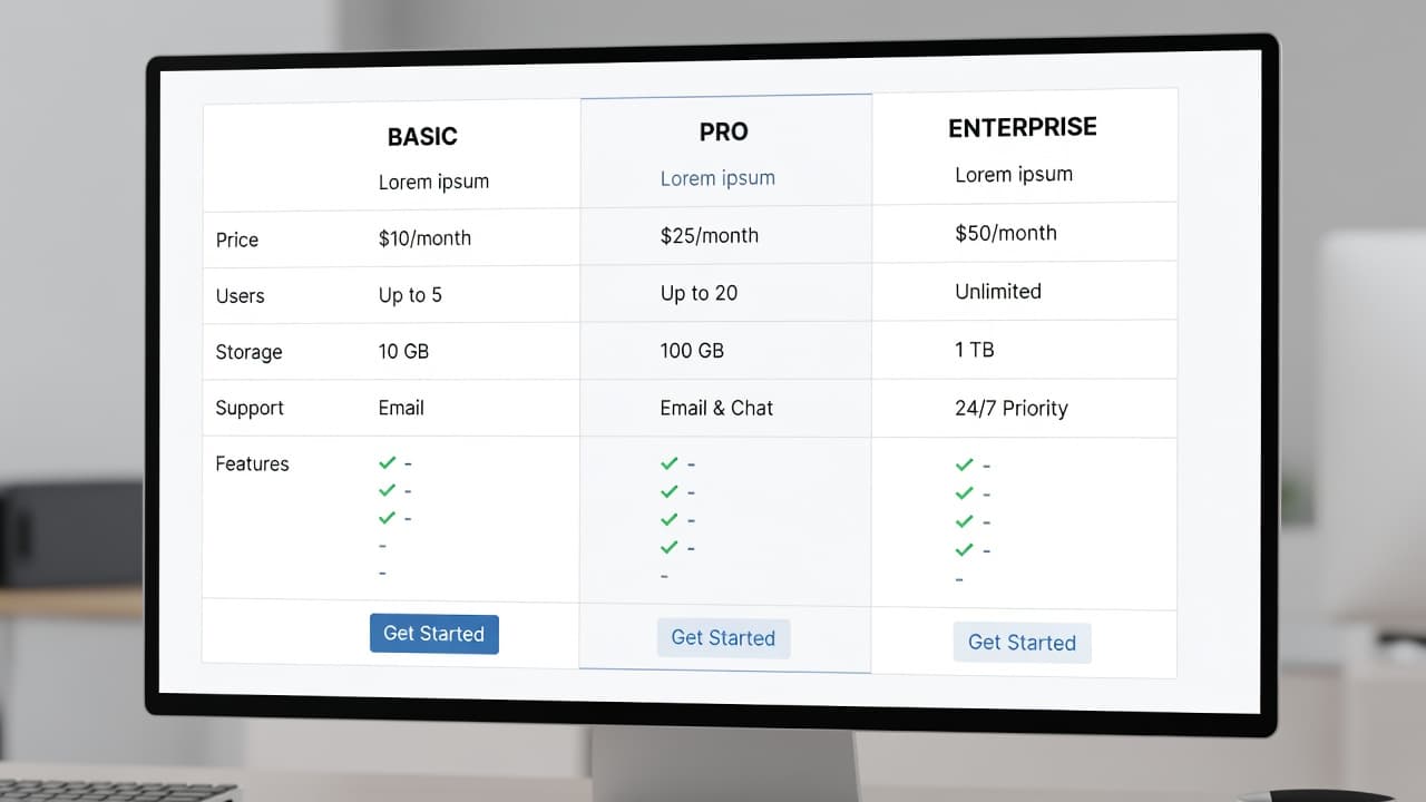
The best tables keep the same row order for every product. That makes scanning easier and stops the page from feeling random. Start with the fit question, then move to price, then add the feature that matters most, and finish with one honest limitation.
The table should not try to list every detail. It should act like a map. Use the rows that help a buyer decide, such as:
- Best for
- Starting price or pricing model
- Core feature
- Main limitation
- Trial or demo option
The page gets stronger when each row answers a real objection. If a tool is great for small teams but weak on reporting, say so. If another tool costs more but includes better onboarding, say that too. Readers trust pages that admit trade-offs.
The visual layout matters as well. Current pricing page patterns lean toward clarity, fewer options, and clean mobile layouts. That applies here, too. On smaller screens, the comparison should stack without making people pinch and zoom. The price should stay visible. The CTA should stay tappable.
If you want visual references, SaaS pricing page examples show how much easier a page feels when the choice is obvious. The lesson is simple, a comparison table works when it removes friction.
Add proof where the doubts show up
A comparison page loses trust when the claims feel thin. Proof has to sit close to the claim, not buried in a paragraph below the fold.
That proof can come from several places. Pricing screenshots help. Feature lists from the product site help. A recent review count can help. So can onboarding details, setup time, and support channels, as long as the data is current.
Use proof that matches the claim you made. If you say a tool is best for small teams, show why. Mention seat limits, admin burden, or setup speed. If you say it is cheaper, compare the same billing cycle and the same level of service. Mixing monthly and annual pricing makes the page feel slippery.
Some useful proof points include:
- Current pricing date
- Billing period
- Feature availability by plan
- Screenshot or product UI
- Security or compliance detail, when relevant
- Trial length or demo access
If a claim needs a footnote, put the footnote in the page.
That line saves a lot of trouble. Readers do not expect every page to be perfect, but they do expect honest signals. If the page says one tool is faster to set up, it should show a reason. If the page says another has stronger support, it should name the support channel or response time.
Proof also helps with search quality. Pages that cite current facts and use consistent terminology tend to age better. Thin pages get stale fast, and stale pages stop converting.
Place CTAs where the reader is ready
The CTA should follow the moment of clarity. If the reader has not seen the comparison yet, the button is too early. If they have already read the verdict, the button is late.
For best-in-category pages, a CTA near the top can work well, especially when the list is short and the intent is broad. For alternatives pages, a CTA after the first comparison block usually performs better. For versus pages, the best CTA often sits near the final verdict.
A simple placement pattern works well:
- Above the fold on “best tools” pages
- After the first summary block on alternatives pages
- Near the decision section on versus pages
- After proof and FAQs on longer pages
The CTA copy should match the intent too. “Start free trial” works for product-led tools. “Book a demo” fits higher-touch software. “See pricing” works when people are still comparing. Do not use a generic button when a sharper action will do.
One primary CTA is enough on most screens. Secondary links can support the main action, but they should not compete with it. If the page offers too many exits, the reader hesitates.
This is also where mobile matters. On a phone, buttons need space. They need contrast. They need to appear when the reader has enough context to act. A sticky CTA can help, but only if it stays useful and does not cover the content.
Keep the page honest and fresh
Ranking a comparison page is one job. Keeping it accurate is the other.
Pricing changes. Feature names change. Trial lengths change. If your page is still quoting a plan that no longer exists, the reader notices. So does the search engine after enough users bounce.
If pricing changes often, tracking merchant price changes for affiliates gives you a useful model for keeping published numbers current. A simple review process is better than waiting for readers to point out mistakes.
A good update workflow looks like this:
- Review product pages on a fixed schedule.
- Check pricing, plan names, and billing terms.
- Refresh screenshots and dates.
- Remove claims that no longer match the live product.
- Re-test CTAs after major page changes.
Disclosure matters here too. If the page earns referral revenue or includes sponsored placements, say so clearly. Readers can handle affiliate links when the disclosure is clear. They do not handle surprises.
Avoid inflated claims as well. Do not say a tool is “cheapest” if you only compared one plan. Do not call a feature “best” if the evidence is weak. Comparison pages rank better when they sound measured, not loud.
A clean page with current facts tends to outperform a flashy page with shaky data. That is because the reader wants a decision, not a performance.
Differentiate with use cases, not hype
Many comparison pages say the same thing in different words. That is why they blur together.
Real differentiation starts with use case. A tool can be better for agencies, while another is better for product teams. One can fit founders who want speed, while another suits larger teams that need admin controls. Those are useful differences because they help the reader picture the tool in their own work.
Skip broad praise like “best overall” unless the page can defend it. A stronger approach is to say where each product wins and where it falls short. For example, one tool may have better onboarding, while another offers deeper reporting. One may be cheaper at three seats, while another becomes more efficient at twenty seats.
That kind of wording makes the page feel honest. It also gives search engines more semantic detail. The page is not just repeating the brand names. It is mapping the category.
Good differentiation messaging usually answers three questions:
- Who should pick this tool?
- What problem does it solve better than the others?
- Who should skip it?
That last question is powerful. When you tell the wrong buyer to skip a product, the page feels less promotional and more useful. It also helps the right buyer feel more confident.
The strongest comparison pages do not act like sales copy with a table attached. They read like a clear recommendation from someone who understands the trade-offs.
Conclusion
SaaS comparison pages rank when they match intent, and they convert when they make the choice easy. The page has to answer the searcher’s question quickly, then back up the answer with facts.
The winning formula is simple. Use a headline that fits the query, build a table that shows real trade-offs, add proof near the claim, and place the CTA where the reader is ready to act.
When SaaS pricing comparison pages do those things well, they stop feeling like marketing pages. They feel like the shortest path to a decision.