
A visitor lands on a SaaS use-case page with one question in mind, can this solve my problem? If the page takes too long to answer, the search click goes cold.
The best SaaS use-case pages do three things fast. They match the search intent, show the product in context, and make the next step obvious.
That sounds simple, but most pages miss at least one piece. The sections below show how to build pages that bring in qualified traffic and turn more of it into demos, trials, or pipeline.
What SaaS use-case pages need to do
A use-case page is not a general product page. It is a focused answer to a specific job, workflow, or pain point.
Someone searching for “expense automation for agencies” does not want a product history lesson. They want to know whether your software can save time, cut errors, or remove manual work in their exact setup. That means the page has to speak to one audience, one problem, and one outcome.
The page also has to do two jobs at once. It needs to rank for the right query, and it needs to sell the next step without friction. That balance is what makes use-case pages useful for both SEO and conversion.
Strong pages usually feel narrow, but not thin. They go deep on one scenario, then use proof and product visuals to remove doubt. A good page is more like a sharp tool than a broad brochure.
Use-case pages vs feature, solution, and industry pages
These page types often get mixed together, which leads to weak messaging. They overlap, but they do not do the same job.
| Page type | Main job | Messaging focus | Example |
|---|---|---|---|
| Use-case page | Solve one specific workflow | Outcome, pain point, and product fit | “Lead routing for small sales teams” |
| Feature page | Explain one capability | What the feature does and why it matters | “Automated lead assignment” |
| Solution page | Show a broader business fix | Multiple use cases around one business goal | “Improve sales operations” |
| Industry page | Speak to a vertical | Industry needs, risks, and compliance | “Software for healthcare teams” |
If the visitor already knows the job they need done, the use-case page usually wins. If they need a wider business story, a solution page works better. If they care about vertical terms and regulations, an industry page is the better fit.
For a practical view of what strong B2B pages look like, Unbounce’s SaaS landing page examples are a useful benchmark. For a conversion-focused angle, Clear Digital’s B2B SaaS conversion best practices lines up with the same goal.
If a visitor has to guess who the page is for, the page is already losing.
Choose the use case with the strongest intent
The best use cases sit where search demand, pain, and product proof overlap. That matters more than trying to cover every possible workflow.
Start with queries that already show clear intent. Phrases like “software for,” “tool for,” “how to automate,” or “best way to” usually point to a real job. Then check whether your product can show a strong before-and-after story in that scenario.
A good use case is specific enough to feel real. “Project management software” is broad. “Project management for creative agencies with client approvals” is much sharper. The second version gives you a real problem, a clear audience, and better copy.
Use cases also need to map to buying stage. Some visitors are comparing options. Others are trying to solve a pain fast. Pages that work well often speak to both, but they keep the message simple. The page should say, “Here is the problem, here is how we handle it, here is what happens next.”
A few strong examples:
- “Invoice approval automation for accounting teams”
- “Customer onboarding software for fintech startups”
- “Lead routing for small sales teams”
- “SOC 2 evidence collection for SaaS ops teams”
Each of those can support a real page because the pain is visible and the outcome is easy to understand.
The page anatomy that earns clicks and demos
A use-case page that converts usually follows one clear path: problem, proof, product, action. The layout should feel calm, not crowded.
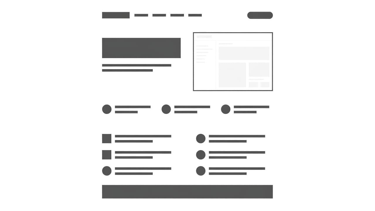
Start with the hero. The headline should name the use case and the result. The subheadline should make the promise concrete. If the visitor cannot tell what your product does in a few seconds, the rest of the page has to work too hard.
A strong page often includes these sections:
- Hero copy that names the problem and outcome in plain language
- Trust signals like customer logos, review snippets, or result metrics
- Use-case explanation that ties the workflow to the product
- Product screenshots or video that show the product in context
- Objection handling through FAQs, security notes, or setup details
- One primary CTA repeated at the right moments
The order matters. Put the strongest proof early, then guide the reader toward the next step. A use-case page is not a maze. It is a path.
If you want a broader set of layout ideas, Apexure’s SaaS landing page best practices is a solid reference for structure and conversion flow.
Headline formulas that fit search intent
Problem-first headlines work because they match how people search. They also help the page feel immediate and relevant.
The best formulas are simple. They do not try to sound clever. They sound useful.
Here are a few patterns that work well for SaaS use-case pages:
- [Use case] software for [audience]
Example: “Invoice approval software for finance teams” - How to [job to be done] with [product category]
Example: “How to automate lead routing with sales software” - [Outcome] for [audience]
Example: “Faster client onboarding for agencies” - The best way to [job] without [pain]
Example: “The best way to collect compliance evidence without manual chasing” - [Audience] [need] software that [result]
Example: “RevOps software that keeps handoffs clean”
These patterns help because they keep the page anchored to a real use case. The visitor sees their own language, not marketing fluff.
A headline should also narrow the promise. “All-in-one platform” is weak for a use-case page. “Lead routing for growing SaaS sales teams” is better because it names the job and the user.
Write copy that sells the outcome
Feature lists alone do not move most buyers. People want to know what changes after they use the product.
That means every key section should translate capability into a result. If your software automates approvals, say what that removes. If it centralizes data, say what that improves. If it speeds up onboarding, say what that means for the customer.
A simple way to tighten the copy is to pair the feature with the business effect:
- “Workflow rules” becomes “Send the right lead to the right rep without manual sorting”
- “Templates” becomes “Launch client onboarding faster with a repeatable process”
- “Dashboards” becomes “See blocked deals before they slow down the pipeline”
This kind of copy feels more grounded because it follows the workflow the buyer already knows. It also helps searchers connect the page to the words they typed into Google.
Keep the paragraphs short. Use one idea per block. Use plain verbs. Avoid long lines of product language that only your team understands.
If the page needs a deeper explanation, use short supporting lines instead of more adjectives. A clear sentence beats a polished one that says less.
Visuals, proof, and CTAs that reduce hesitation
People trust what they can see. That is why product UI matters so much on use-case pages.
Stock photos and abstract art rarely help. Real screenshots, short clips, and simple walkthroughs do a better job because they show the product doing the work the copy promises. In 2026, that matters even more because buyers expect faster proof and less fluff.
A page that shows the interface in context helps readers picture themselves using it. A short screen recording or GIF can do even more. It shows motion, sequence, and ease. That is stronger than a still image with no context.
The same idea applies to proof. Show logos if you have them. Add short quotes that mention the exact use case. Include results when you can back them up. A vague testimonial rarely carries the same weight as a specific one.
The CTA should match the visitor’s confidence level, not your sales target.
For low-friction traffic, “See it in action” or “Book a demo” often works well. For self-serve products, “Start free trial” may fit better. The key is consistency. Do not hide the CTA until the bottom of the page.
Place the main CTA above the fold, then repeat it after proof sections. Keep the visual style simple. If every button fights for attention, none of them wins.
SEO moves that still matter in 2026
Use-case pages still rank when they are specific, useful, and technically clean. Search engines reward pages that answer a clear question well.
First, make the page match one intent. Do not try to rank a single page for every related problem. One page can target one use case, one audience, and one primary outcome. That focus helps both search and conversions.
Second, write for the query without stuffing it. Put the use case in the title, H1, and early copy where it fits naturally. Then use related language in the body. Synonyms help, but only when they sound like something a customer would say.
Third, keep the page light and fast. Large images, heavy scripts, and cluttered layouts hurt mobile performance. Since many visitors arrive on mobile, speed is part of the page’s job. It is not a technical side note.
Fourth, use FAQs to answer the questions that slow buyers down. Security, implementation time, integrations, pricing, and switching costs are common concerns. If the page handles them cleanly, it can keep the visitor moving.
Fifth, update the page often enough to stay current. Fresh screenshots, current customer logos, and recent proof feel more trustworthy than old assets. Search behavior changes too, so pages should stay close to how buyers talk now.
If you want more examples of how these pieces work together, B2B SaaS conversion best practices is a useful companion read. It shows the same principle from a broader site-conversion angle.
Common mistakes that weaken the page
Most weak use-case pages fail for the same few reasons.
- The page tries to speak to everyone and ends up sounding generic.
- The headline hides the use case and makes visitors work too hard.
- The body copy talks about features first instead of outcomes.
- The page uses stock imagery where real product screenshots would help more.
- The CTA appears too late or changes meaning from section to section.
- The FAQ answers nothing important and wastes valuable space.
- The page borrows language from the feature page and loses its use-case focus.
Another common mistake is building a page with no proof close to the top. Visitors need a reason to trust the claim before they scroll far. Logos, metrics, and direct quotes help with that.
A final issue is cross-wiring page types. A use-case page that tries to behave like an industry page can feel vague. A page that acts like a feature page can miss the bigger business result. Keep the purpose clear, and the copy gets easier.
Conclusion
A strong SaaS use-case page does one job well. It speaks to one audience, names one problem, and shows one clear path forward.
That is why the best pages rank and convert. They feel specific enough to win the search click, and direct enough to hold attention after the click.
If a visitor can land on the page, recognize their problem, and see the product fit within a few seconds, the page is doing its job. That is the standard worth building toward.